The Home Team
Written by Jessen O’Brien / Photography by Alise O’Brien
For nearly 30 years, ADJ Interiors has made it a policy to embrace projects of all sizes and budgets. “You just never know where things will lead,” says April Jensen, CEO and founder of ADJ Interiors.
Case in point: In 2017 ADJ Interiors started working on a kitchen for homeowners Renée and Bill Schmidt. That job turned into a gut renovation and designing not just the kitchen, but also most of the first and second floors -- followed by the home’s lower level. In fact, it’s not over yet; Renée and Bill are currently working with April and Meagan Cooperman, an interior designer at ADJ Interiors, on phase three: the master suite, an outdoor living area, and an addition off of the existing breakfast and hearth room.
The project started small in part because, as Renée puts it, “I didn’t really have much interest until I started working with April and Meagan. I’ve worked with other designers and they never quite got my vision or they didn’t listen to me. April and Meagan listened to everything. They understood my style even though I didn’t know how to put it in words and presented things that I would have picked out if I had the resources or knew where to find them.”
Ensuring that clients feel heard is a major part of April’s design philosophy. “I’m 100 percent motivated by smart interior design that functions and serves its users in the way that they need it to, not the way that I think it should,” April says. “My team comes to every project with nothing in mind other than establishing with the client what they need, what their priorities are, and what their dream is, not ours.”
Coming into a project without a defined style or preconceptions about the space is challenging, but the hard work pays off in interiors that truly reflect the people who inhabit them. If, that is, the designers communicate well with their clients and work together as a team, two skills at which the designers at ADJ Interiors excel.
“We have had such phenomenal, open lines of communication with April and Meagan. It’s truly refreshing. They are extremely responsive to us,” Bill says. “And they’re just a joy to work with. If I know we have a meeting with April and Meagan, that’s actually a really fun time for us!”
At first, the brief was simple. The Schmidts had purchased a new home and they wanted to give it a minor refresh before moving in. They especially wanted to see what could be done about the kitchen, which had a tricky layout (to start with, the refrigerator and freezer were on opposite walls) and one big aesthetic issue: a large hood that hung over the central island, spanning about 55 inches across and blocking both the view and the light.
“I remember April saying, ‘Look, I can work with this kitchen, and it’ll be great. But if you can give me a blank slate, this kitchen will be magnificent,’” Bill says. “I was struggling with the kitchen as well, and when she made that comment, I immediately said, ‘Done—we’re doing it.’”
In order to lay the groundwork for the room’s new layout, April and her team started by establishing how the Schmidts were used to moving in their previous home. They took out the hood and rearranged the appliances, putting the refrigerator and freezer side-by-side.
Visually, they knew that Renée liked a French influence. At the same time, “I wanted a white kitchen. I wanted it light, airy, and functional,” Renée says. “I like things to be clean and streamlined, without a lot of clutter.”
The key to the design proved to be finding the right color: Maritime White, a Benjamin Moore neutral with a cream undertone that serves as a unifying element throughout the home. In the kitchen, it appears on the cabinets, woodwork, and doors. Two chandeliers were installed above the island where the hood once hung, as Renée loves crystals. “And the bigger, the more sparkle, the better,” April says. “That’s [Renée’s] personality too. She’s full of life; the whole family is. It’s what I love about going into a project without a predetermined idea of what it should look like; once you work organically with your client, [you can tell] their story so easily if you listen.”
Renée’s love of sparkle also inspired the countertops, a white diamond quartzite that’s almost opal-like in its iridescence. “Everyone who comes here comments on it,” Bill says. One contractor even brought his wife over to show her, saying he had never seen countertops—or a kitchen—quite like it. To ground the bright, white countertops, ADJ Interiors paired them with a more traditional, French-style island in black, its edges intentionally worn and aged.
“The island is gorgeous, but it actually works,” April says. “For instance, we had to make sure we had plenty of outlets disguised underneath so that each person could sit and have all the ports they need. So while it’s beautiful—and it looks like that everyday because Renée takes such good care of things -- it actually does function at a high level for multiple purposes.”
Nearby, the custom butler’s pantry is painted a cheery sky blue. Since Renée loves blues, different shades -- from chambray to platinum -- are used throughout the house. Water Street Brass hardware unites the pantry with the kitchen cabinetry, while a backsplash of antique-mirrored subway tile provides an extra dose of shimmer.
April had a custom shade mixed for the butler’s pantry after Renée proposed painting it blue.
A softer version of the butler’s pantry’s sky blue can be found in the dining room’s grasscloth walls and in the small flowers on the dining room table. When Renée and Bill first married, they had invested in a Bernhardt dining set in mahogany. “Over the years, it just felt so heavy to me,” Renée says. She fell in love with a table by Arhaus but wasn’t sure it would fit the vision of the room. “April said, ‘Buy it. You should surround yourself with things you love. We will incorporate it.’”
ADJ Interiors balanced more traditional items from the Schmidts’ previous home—such as a favorite chandelier and gilded wall mirror—with a marbleized buffet and gold Ted Collier painting.
The chandelier and full-length mirror both came from the Schmidts’ previous house. April then found a John-Richard buffet in gold with a marbled front, injecting the space with an unexpectedly modern element, to keep the design fresh. A gold painting from Ted Collier’s Pointillism Series completes the room.
More unexpected juxtapositions can be found in the living room, where an Oriental rug, leather chesterfields, and rustic paneling are mixed with an ultra-modern chandelier and graffiti-style painting by Peter Manion. “The art is unexpected. It’s very modern compared to the space it’s in—I love that aspect of the space,” says April. “It was important to the Schmidts to layer locally-commissioned artwork into these beautiful spaces that helped tell a story and not be traditional art.”
Contemporary vases sit side-by-side two stone urns in the living room.
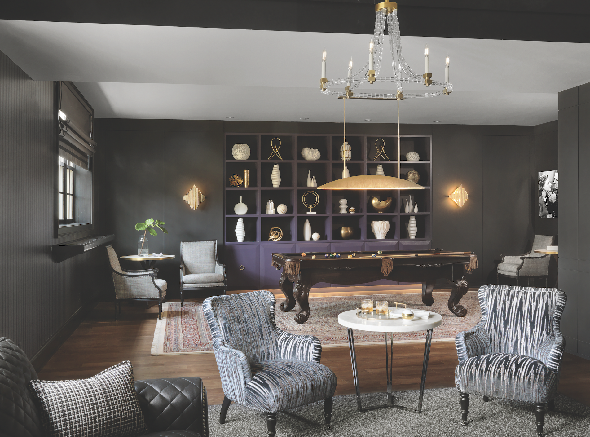
Once the first floor was complete, the Schmidts turned to ADJ Interiors for help with the lower level. This time, they told April to run with her vision. Since Renée wasn’t a huge fan of lower levels as a rule, April set out to create a space that was irresistibly fun. A striking Art Deco tile by Ann Sacks became the inspiration for a dark but glamorous billiards room, kitchenette, and movie theater rendered in black and gold, with touches of a rich purple and deep teal mixed in.
Style and function combine in the movie room, with its shagreen ceiling, sound absorbing panel, and automated entertainment system by Fusion Media Systems.
The vintage sconces that bookend the plum shelving unit act as door handles for hidden storage.
Behind the billiards table, vintage sconces flank a large built-in and double as handles for hidden storage units. A Turkish rug brings together the level’s various jewel tones, while nearby a modern chandelier riffs on the more traditional fixtures upstairs. Two custom doors inlaid with antique mirrors slide to reveal a movie theater with enough plush seating to comfortably fit an entire field hockey team—about 24 girls in total—the night before the state championship.
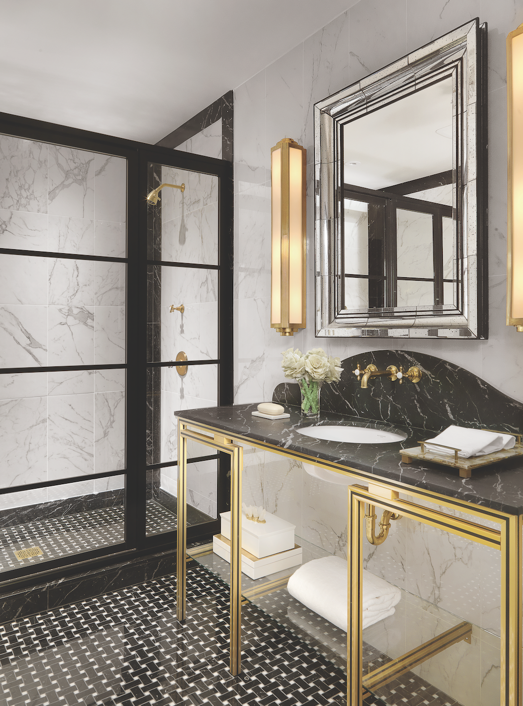
But the real star of the lower level isn’t the candy station right outside the movie theater; the domed Kelly Wearstler pendant that hovers over the billiards table; or even the gold-and-black feature tile that inspired the design in the first place -- although all of those elements add to the lower level’s speakeasy-like sensibility. It’s the bathroom, styled after a men’s tuxedo, that steals the show. “It’s what blows me away every time,” says April. “We had the vanity custom made with these black outlines that accentuate the depth and line, like a racecar. I just love it so much.”
Although Renée had originally thought the lower level would be more for the kids, she and her husband love spending time in it. “I look at it and I get happy,” Renée says. “And when people say, ‘Your lower level’s unbelievable,’ I say with a laugh, ‘Thank you; it is. I had nothing to do with it.’ Because it was totally their vision down there.”
“[This project] is what you dream of,” April says. “Clients who appreciate you. Who listen and let you do your thing. Who took their project as seriously as we did. There was mutual collaboration and mutual respect. And at the end of the day, all of what we do -- no matter your profession -- is about our relationships.”
Westport Tile & Granite worked with ADJ Interiors on all the bathrooms and countertops.


