The Diderot Effect
C&M Interiors transformed a 1923 house into a sea of serenity with the feel of a boutique hotel.
By Christy Marshall Photography by Corey Hogrefe, CH Studios
A decade ago when this homeowner strolled through the front door of this century home in Parkview Place, she was moonstruck.
“It was love at first sight,” she recalls. “I still remember how I felt walking through the Open House. We put an offer in the next day. I fell in love with the character and the architectural details. We still have the original leaded glass doors and the arched windows in the sunroom.”
While the home captured her heart, the décor did not.
“The previous owners took great care of the house, but they had lived here 30 years,” the homeowner says. “I believe they did the vast majority of their renovating and updating in the 1980s. It was dated.”
Soon after the couple moved in, they redid the kitchen. But the rest of the house and all of the bathrooms beckoned so the homeowners sought out interior designers and landed on Channing Krichevsky and Maria Hogrefe of C&M Interiors. The women, now in their 30s, started the firm when they were 23. Today C&M has a staff of seven.
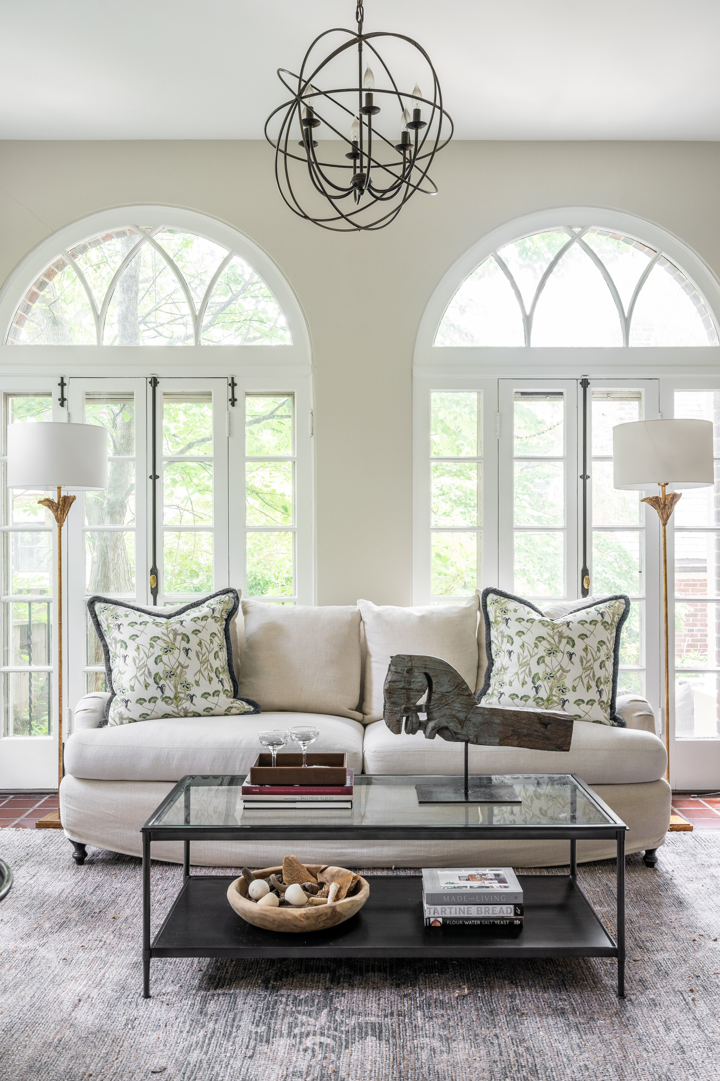
The first assignment was the living room and then an update of the bordering sunroom. The house was filled with pieces the homeowner had either found at estate sales, collected as hand-me-downs, or inherited.
The first room C&M designed, the color palette was dictated by the portrait painted by artist Chuck Dwyer on the mantel.
“I had outgrown the furniture,” she confesses.
The living room’s design was dictated by a portrait by Milwaukee artist, Charles Dwyer, leaning atop the mantel. The designers bought new furniture but mixed it with vintage pieces, such as the antique French mirrored drum table found on 1st Dbs. The homeowner already owned the artwork, including the huge poster on the wall.
“My parents collected French posters years and years ago and as they downsized, I was very fortunate to inherit some,” the homeowner says.
After the sunroom was spruced up, the design duo (lead by Channing) turned to the dining room. At first, it was just a touch here, a change there. It wasn’t enough. They ending up redesigning the entire room with all new furnishings, new Porter Teleo wallpaper, new drapes.
One of the house’s attributes that most attracted the current owners is the original architectural details, like the arched windows in the sunroom.
“I love how elegant this room feels,” the homeowner says. “It's still has some casualness to it. It's not very formal, but it's elevated.”
But soon — very soon — after the designers started working their magic, the homeowner began adding more rooms to be done.
At the outset, the designers were going to work with existing furniture. It didn’t work. They redesigned it with new furniture and lighting.
“We knew that we wanted to do the second and third floors and all the bathrooms needed to be updated,” she says. “I mean, it was always going to be Phase Two. But when we saw this come together so beautifully on the first floor, I said, ‘Okay, let's go, time to go.’ There’s a name for that. It’s an effect.”
Whimsical to say the least, the wallpaper is titled “Mr. Blow.”
Phones are grabbed; the sound of fingers frantically tapping resonates in the air. Eureka. It’s called the Diderot Effect. Definition: Obtaining a new possession often creates a spiral of consumption, which leads you to acquire more new things.
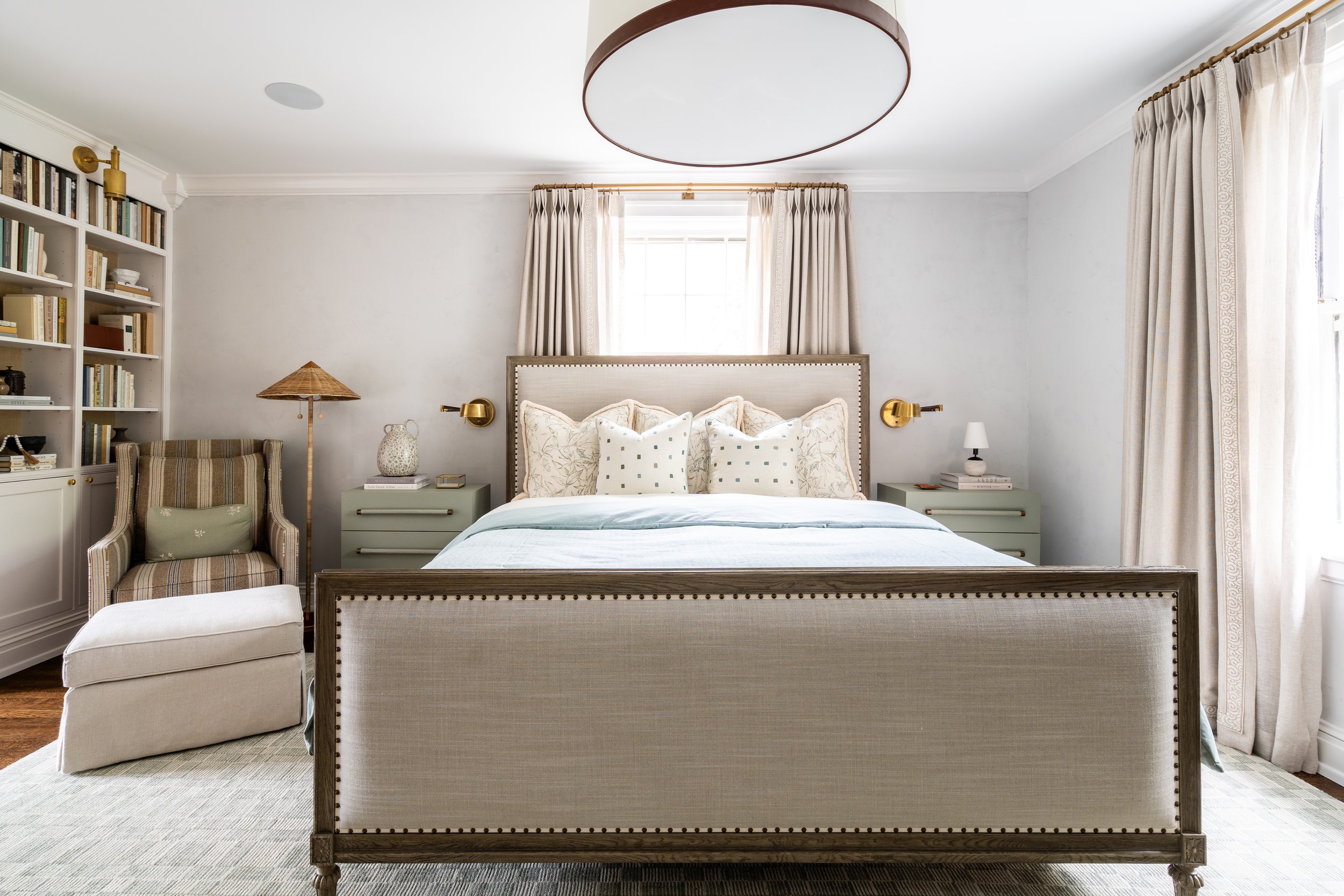
With the exception of the kitchen and one powder room, C&M Interiors touched nearly every other space in the 4,000-square-foot house. Going up the original stairway, the second-floor landing opens into the primary bedroom suite. The walls were painted in a Venetian-plaster-like finish by Portola. All new custom bedding and drapery were added. The nightstands came from Chelsea Editions. Built-in bookshelves (chock full of neutral-colored books) were created by Marc Christian, who also did all the cabinetry in the bathrooms and in the earlier kitchen remodel. In the adjoining office, the designers (again with Marc Christian) added a tea nook.
The second-floor landing opens into the primary suite which was wallpapered and updated with new bedding, drapes and furniture.
“You’ll notice we have different window treatments throughout,” Maria says. “They all tie together really well, but we were able to use really great textures in different spaces. We added little trims and tapes everywhere and have the layering of the shears in certain rooms.”
The bedroom opens into a light-filled office with a built-in coffee/tea nook. The desk was existing; the rest of the furniture is new.
The primary bathroom was gutted and transformed. When the homeowners moved in the room had a small shower, toilet area, and oversized Jacuzzi smack dab in the middle of the space.
“I said that I really want a spa-like bathroom with white marble and unlacquered brass,” the homeowner says. “And it is just what it is. When I go on vacation, I’m very excited to get home to my bathroom.”
This space was completely gutted to make room for what the homeowners desired: “a spa-like bathroom.”
The closets were redone by New Space but with Channing consulting on the countertop finish, hardware and paint.
The house has four bedrooms. C&M redid them all—and all of the upstairs bathrooms.
The design of the second floor bath was dictated by the homeowner’s affection for the wallpaper.
“This one was a gut too,” Maria says, referring to the second bath on the second floor. “The space was still the same, but everything was redesigned in here.”
The homeowner was immediately smitten with the wallpaper. “I feel like we kind of designed all of the finished colors and the tile selection and the vanity paint color around that particular wallpaper,” Channing adds. Throughout the house, the designers picked fixtures by Waterworks that they sourced locally through Immerse.
The second guest bedroom was also redone by C&M. “It’s dreamy,” Maria says. “It feels like you’re in an English garden.”
The second-floor guest room was rejuvenated with wallpaper, new bedding, new drapes. The homeowner had collected the artwork over the years; the designers’ assignment was to find the perfect places to put it.
“We had a friend recently come through the house,” the homeowner recalls. “He said, ‘I'm walking through and I feel like I'm in this boutique hotel.” While the artwork previously existed in the room, the furniture is all new.
On the third floor is yet another bedroom and another bath, gutted and redone by the designers. The vinyl wallpaper is a whimsical pattern of blow fish, titled Mr. Blow. Channing customized it by choosing the background color.
Although the project started in the throes of the pandemic, there were few snafus. But then again, there was still a lot going on. During the three years of working on the house, both designers had babies. Three babies in toto: Channing had two, Maria had one. In fact, Channing styled the primary suite the day before she went into labor.
Before everyone left after the interview, the homeowner mentioned that first floor powder room. The one the designers hadn’t touched. Yet.
“I’ll be calling,” she said.
It’s the Diderot Effect.


