The Glass House
A Mission-style house that was originally dark and rustic is now a vision of light.
By Christy Marshall / Photography by Alise O’Brien
The first time these clients called Kelly Johnson of Kelly Johnson Design, they asked her to redo their home in Frontenac. Then they changed their minds. They found a house in Ladue with “good bones” but not in the style they wanted. The walls were clad in barnwood; the view just beyond the cathedral front door was into a massive bar at the back; the ceilings were low; the interior was rustic and dark.
“It was a mishmash of Spanish Mission with mountain modern,” says architect Nick Adams of mademan design.
But these homeowners wanted a house that was clean, contemporary, fresh, and flooded with light.
“We really wanted the open concept, a modern yet warm home,” the homeowner says.
So, Kelly created a team with Nick and Kelly Kenter, president-ceo of the construction company Sitelines, to make that vision a reality.
The result is, in a word, stunning.
“The before and after is night and day,” Kelly says.
The view from the glass front door now soars through the house to a newly built poolside pavilion in the back that is fronted by a wall of waterfalls. The home’s rustic flooring has been replaced with 2-by-4 feet porcelain tiles that run throughout the house and (in a thicker version) onto the outside living area.
“Now this home is a glass house so the inside and outside are seamlessly blended together with the architecture,” Kelly says.
Shot at dusk from the pavilion, the sight lines travel straight through to the front door.
With the exception of one sofa (which they got rid of later), the homeowners sold all their belongings from their Frontenac house. Nothing beyond the basic footprint of the original Ladue house remains the same. The house measures more than 12,500 square feet of indoor-living space with four bedrooms, four full baths, and seven powder rooms.
“Nick did a brilliant job with the architecture,” Kelly says, adding later, “I have to tell you, Nick is, in my opinion, one of the most talented architects in St. Louis.”
The homeowner agreed. “He gets it and he’s very creative. He narrows it down to what you’re looking for and he has great vision.”
When they started, Nick says he “pushed to get everything on the same page. We got rid of all the mountain modern. We were trying to be reasonable about spending the client’s money. The stucco, the wood shake shingles, the concrete is all part of modern architecture. We took it to more of a California Mission style.”
What once was dark and rustic is now a vision of light.
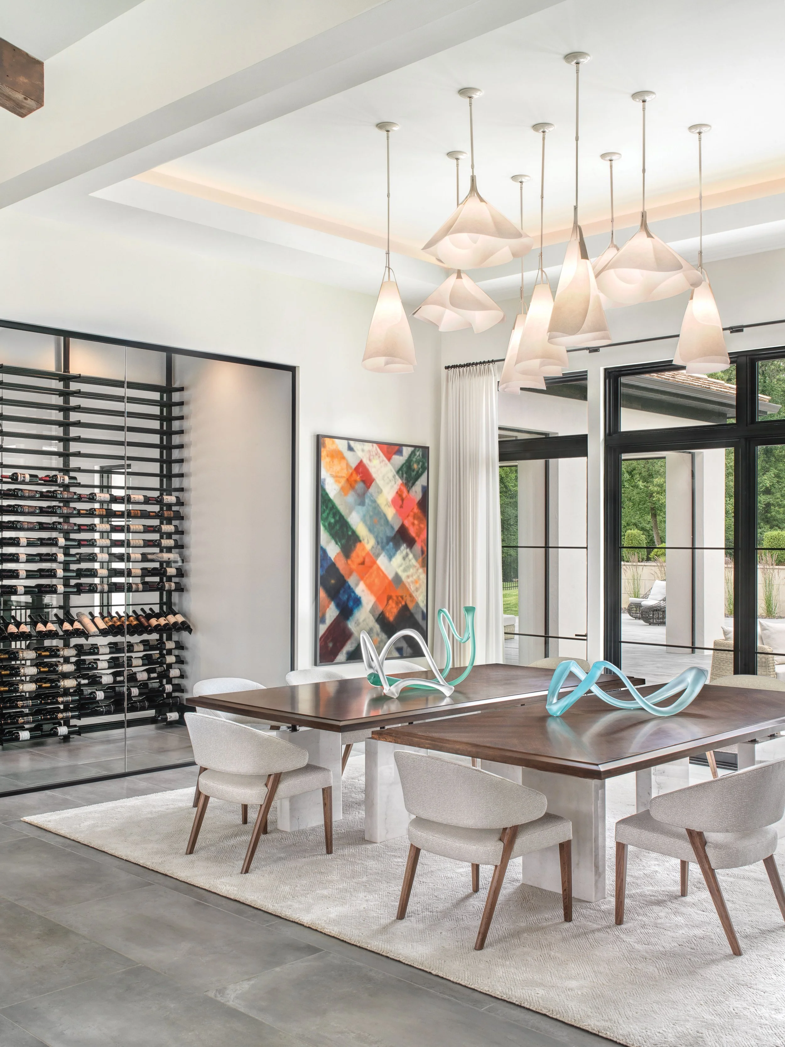
The house’s color palette of white, gray, and black just “seemed to organically blend with the architecture,” Kelly explains. The great room inside the front door was completely redone with seating that leads onto the dining room and kitchen. An Arthur Osver painting sourced by Bridget Melloy of projects + gallery from Philip Slein Gallery hangs over the mantle. Dramatic lighting selected with the help of Bill Hughes at Amini’s illuminates the space. A large glass-enclosed wine cellar divides the dining room from the stairway. Instead of having one huge dining table, they added two.
The dining room was so large only two tables would work. The wall of windows looks out onto the pool and pavilion.
“Any single dining table, whether it was a square or a circle, wouldn't have worked,” Johnson explains. “So, I came up with the idea of doing the double dining tables, which actually worked well. But because there were two dining tables, I used multiple lighting fixtures and made it more of just a sculptural type of thing.”
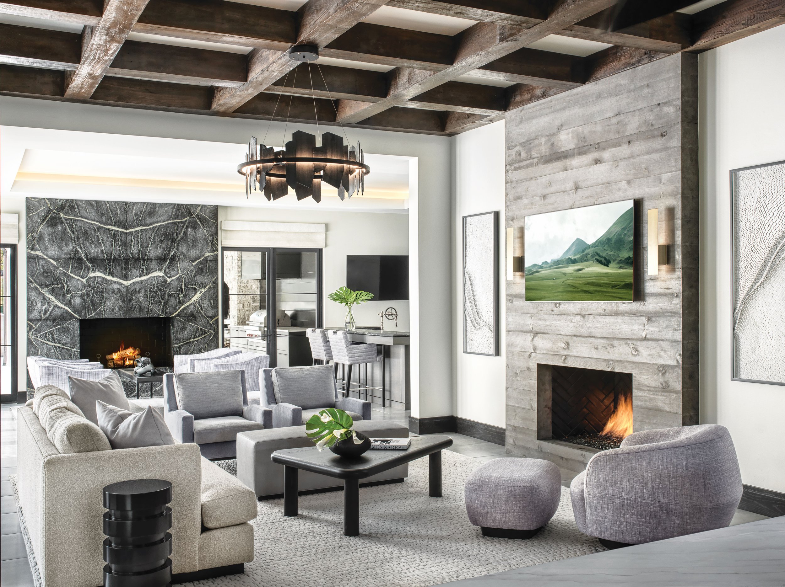
The cabinetry throughout the house was designed by Kelly and Jim Howard of Alspaugh Kitchens & Baths. The kitchen has, Kelly adds, “every bell and whistle.” Beyond is the hearth room with a TV, two fireplaces, a bar, and plenty of room for the family with three children (two in college, one a senior in high school) and three dogs: Chief, a golden retriever; Ruby, a Cavalier King Charles Spaniel; and Shiloh, their Boxer.
The Great Room is located inside the front door and features contemporary lighting and a painting by Arthur Osver.
What had once been a screened in porch with barnwood siding was gutted and rebuilt into a four-seasons room.
“The idea of this room is that the doors and windows can just disappear and when the climate is right and when they want to use it that way, this all becomes part of the outside space,” Kelly says.
Adjoining the space is a bar with a counter of soapstone. The original outdoor fireplace was redone; a pizza oven was added.
The cabinetry was designed by Jim Howard of Alspaugh Kitchen & Bath and designer Kelly Johnson.
Aside from this main kitchen, the homeowners, who entertain frequently, added a catering kitchen which is accessible from the back driveway.
The primary bedroom was reworked into a sea of serenity. Kelly and her team had the fireplace redone and added an upholstered wall. An office is off the bedroom. The previous owner was a bachelor and his closet was complete. But the wife of the couple needed her own and now her walk-in is replete with coffee bar, a stacked washer/dryer, and a steam closet.
The primary bedroom is elegantly serene.
The fireplace adds to the serenity.
“She can just put one of her clothes in there and that's it,” Kelly says. “You hang them up and they un-wrinkle. So, there's no more ironing.”
The primary bath was ripped out and all new tile, plumbing fixtures, and cabinetry were added. “The common denominator is that see-through shower,” Kelly says.
The lower level was unfinished when the couple bought the house. Now? It could easily double as a New York cocktail lounge. As the homeowner quietly (but correctly) points out, “It’s swanky.”
“It would be the nicest restaurant in St. Louis, if it was a restaurant,” Nick says, crediting Kelly with the design.
Cozy with two fireplaces, the hearth room opens up to the back living area and an adjoining bar.
Connoisseurs of fine wine, there is a huge wine cellar and a lounge with comfortable seating, cocktail tables. A Richard Serra painting adorns the wall.
Close your eyes, and you could be in a Ritz bar. In New York. Or Paris.
The homeowners wanted a media room but not the typical screening room with an abundance of BarcaLoungers. Kelly found a line of modular motorized seating which both looks like the conventional and is extremely comfortable.
“They can have the theater experience without those clunky theater chairs,” Kelly says.
The homeowners ended up adding on to the house, including an office off the front, casita (with a bedroom and full-bath), and additional garages, as well as the pool pavilion in the back.
The transformation of the house started in June 2020 and was completed in April 2022. The homeowners lived through every minute of it.
“That was a terrible decision,” the wife says. “I would never, ever do it again.”
The family moved from section to section of the house as it was completed. The kitchen consisted of a folding table, microwave, and mini-fridge. Plastic sheeting hung everywhere. The painter and tile installer came everyday — for 18 months.
“They had electricity but that’s about all you can say,” Kelly adds. There was also very little furniture.
“We purchased everything right after the pandemic during this huge supply chain crash. Furnishings that would normally take three months to come in, were taking, like, 23 months,” Kelly says. “Pieces were brought in one at a time.” There was no big reveal.
In the end, the results are flat out breathtaking. Both Nick Adams and Kelly Johnson credit the homeowners.
“The thing that was unique to me was I so rarely come across clients with an appetite for doing more than less,” Nick says. “Never before have I gone to a meeting and proposed a large amount of new square footage and a casita that weren’t asked for by the client and the client had no problem stomaching the bill and extending the time to make it happen.”
“We were really lucky that we would present our concepts and they pretty much just gave their blessings,” Kelly says. “They trusted us, which is the key to the success of the project.”


