Sophisticated Living SOPHI Awards 2024
Welcome to the first SOPHI Awards
“Talent wins games but teamwork and intelligence wins championships.” Michael Jordan
In the pages that follow, you will see the winning works of local designers, architects, builders and artisans. For Sophisticated Living’s first-ever SOPHI awards, we invited individuals to send in their finest work. Since this isn’t the only design awards game in town, we weren’t sure how many would actually enter.
We were, in a word, stunned. By the last deadline day, 264 entries had been submitted. So many people took up the mantel that we had to double the number of judges reviewing and assessing the applicants.
But as Jordan, the legendary Chicago Bulls player, points out: It’s a team effort. It may start with the inspiration of the designer or architect (or the exceptional talent of one player) but the execution is achieved with the help of many, many others. It’s the design associates, suppliers, cabinet makers, carpenters, upholsterers, painters, masons, lighting designers, electricians, plumbers. It’s the person artfully laying tiles or installing carefully crafted hardwood floors. Or that determined soul who spends hours scouring the internet and vendors for the perfect piece to complete a room. It’s the architect who finesses every detail of a blueprint to create something that soars beyond the client’s imagination. It’s the builder who converts those plans into reality. It’s the landscaper who basically ices the cake by creating surroundings which enhance what everyone else has done. It’s the woodworker who crafts a piece of art. It’s the photographer who captures the beauty with a click of the camera.
It takes more than a village to create a masterpiece.
It takes a city.
I can honestly say that it is the magazine’s privilege to celebrate all the talent in our area. Each month we feature a house; this month we get to recognize 42. A year from now when we launch our second year of awards, it will undoubtedly be more.
I want to personally thank each of the judges for so diligently (and may I point out fairly quickly) undertaking the task of evaluating the entries. It was a daunting task and they did it seamlessly.
But above all, I want to congratulate each one of the winners and finalists. As you will see in the following pages, the competition was fierce. And you are only seeing the three or four that scored highest. In most cases, the margins between placing and being a runner up was miniscule. A half point. A point. I’ve always known the depth of the design talent in this town was impressive. The following pages only confirm that.
The entries were breathtaking making my job so much harder or which pictures to feature and the hardest of all, which makes the cover.
I thank every entrant. Your fine work has made our debut into the awards world a resounding success.
I can’t wait until 2025.
The SOPHI Awards 2024 At-A-Glance
The Ones to Watch
by Christy Marshall
As we have said repeatedly, St. Louis has a great depth of talent. A number of firms are decades, even generations, old. HOK. Mitchell Wall Architecture & Design. Castle Design. The Lawrence Group. But every year, there are young designers graduating with their degrees or others, long out of college, who recognize an inherent love of — and talent for — the craft and start working in the field. Some begin as assistants or interns in larger design firms. Others have been out there plying their trade for years but they somehow escaped our notice. Each of these entrepreneurial souls hung out her own shingle and launched her own firm. Beyond C&M (our first choice), we wanted to highlight a few stellar others we consider to be well worth watching.
Channing Krichevsky and Maria Hogrefe , C&M Design
Maria Hogrefe and Channing Krichevsky, C&M Design.
Channing Krichevsky and Maria Hogrefe are co-founders and principal interior designers of C&M Interiors. They met in design school at Maryville University. They became fast friends with ideologies that beautifully aligned. They both believe that the most beautiful spaces are a little bit imperfect, authentic materials are of top priority and the client should stand front and center. At 23 (Channing) and 22 (Maria), the duo decided over a pitcher of sangria that building a company and creating a design world that was solely their own was their shared dream. In 2016, C&M Interiors was formed with goals that are ever evolving and expanding into the future. Currently, the team is working on growing their national presence and gaining client trust across the nation with aspirations of international work and forming a truly bespoke lifestyle brand. Here at the magazine, we have been struck by the number of times they went to existing experts to pick their brains and get their advice. It’s paid off.
And Others on Our Radar ...
C&M Design
C&M Design
C&M Design
Chelsea Smith, Chelsea Design Company
Chelsea Smith, Chelsea Design Company.
An active designer for the past decade, Chelsea Smith graduated with a Bachelors of Design from Chicago’s Harrington College of Design. She has headed her own firm for the past seven years. Chelsea Design comes with a deep bench. On staff is her design assistant, Christopher Amburn; her head of fabrication, Sindy Obremski, and then there is her husband, builder Konnor Sincox of Wise Bros Contracting Services. Chelsea works with all builders but a number of tehm have been executed by Wise. Growing up in a unsettled family like, Chelsea says she “filled pads of grid paper with line drawings of floor plans and home exteriors and she dreamt of living in the homes of real estate magazines. Design was a healing force in my childhood … I honestly adore everything about design. I love that it is a form of therapy, and that it can rejuvenate your soul. A renovation of your home can single-handedly upgrade your everyday life.”
Chelsea Design Company
Chelsea Design Company
Aisling Leonard, Ash Leonard Design LLC.
Aisling Leonard, Ash Leonard Design LLC.
If you are looking for a bit more international expertise, Ash Leonard may well be your cup of team. She grew up in Dublin, completed her design training at the Dublin Institute of Design in 2006, and then started designing for clients in Dublin, Boston, and for the past 14 years, here in St. Louis. The Leonard approach? “The clean, defined lines typical of Dublin’s Georgian architecture are reflected in my preferences for the home, while the strong connection to the past and the importance of family are reflected in my use of heirloom pieces that truly personalize a space,” Ash says. “As a designer, I have brought a fresh perspective, and new ideas, to problems that clients have thought insoluble, or outside their budget, changing their homes in ways they hadn’t imagined.”
Ash Leonard Design LLC.
Aisling Leonard, Ash Leonard Design LLC.
Sisters Rebekah Murphy and Katherine Moore recently partnered together to start Murphy + Moore Designs. With parents who loved building homes and pouring over all the details, Rebekah and Katherine’s creative beginnings included being surrounded by architectural plans. There were always wallpaper samples, textiles and blueprints covering their dining room table. A few years back, Rebekah co-founded the company, Stone Hall Cabinetry. Both Rebekah and Katherine have been focused on cabinetry design work, winning awards and being featured in multiple lifestyle publications. “Murphy + Moore Design is dedicated to designing and decorating the homes for their roster of clients," Rebekah says. “We live and breathe interior design and architectural space planning.”
Katherine Moore, Murphy + Moore Designs
Rebekah Murphy, Murphy + Moore Designs
Murphy + Moore Designs
Murphy + Moore Designs
Murphy + Moore Designs
And Presenting the SOPHI AWARDS are…
Susan Sherman, Co-Founder and Chair, Saint Louis Fashion Fund and Co-Founder of MERCH
Susan Sherman, Co-Founder and Chair, Saint Louis Fashion Fund and Co-Founder of MERCH
If you want something done in this town, you call Susan Sherman. A native of Jacksonville, Florida, she studied classical ballet for a dozen years, graduated from the University of Georgia with a degree in journalism before working in broadcast news in Atlanta and Paris. She and her husband, David, lived overseas for three years from 1989 to 1992. They moved to St. Louis a year later and ever since she has considered herself a “cultural ambassador” for the city. She and David, who works in finance, have a son who recently graduated SCAD in Industrial Design and lives in St. Louis, and their daughter is a senior social media strategist for ALO in Los Angeles. In St. Louis, Susan Sherman has been a key player in the development of the Contemporary Art Museum of St. Louis and has served on numerous boards including Center of Creative Arts (COCA), Grand Center, Opera Theatre of St. Louis (OTSL) and American Ballet Theatre (ABT) in New York. Today she is the chair of the Saint Louis Fashion Fund, which she co-founded with three other women in 2014 and is now celebrating its 10th Anniversary. The intent of the organization is to reclaim the city’s rich fashion history and “to make St. Louis an epicenter of fashion again.” Fashion is a $7.7 billion dollar industry in St. Louis. In 2019, she co-founded MERCH, an experiential retail concept that brings high fashion brands to our city.
Andréa Purnell, Community Collaborations Manager, Saint Louis Art Museum
Andréa Purnell
Community Collaborations Manager, Saint Louis Art Museum
Andréa Purnell has built a career facilitating arts engagement to empower communities and improve well-being. She joined the Saint Louis Art Museum in 2017 and currently serves as the Community Collaborations Manager. Her major contributions at SLAM include co-curating the groundbreaking exhibition “The Culture: Hip Hop and Contemporary Art in the 21st Century” in 2023; engaging as a key curatorial liaison to the community during the 2018 “Kehinde Wiley: Saint Louis” exhibition; the co-development of the Staff Programming Opportunity Team, a program that encourages staff input and promotes diverse thinking using institutional collaboration with fresh perspectives, and the inception and implementation of the Five Pillars Community Engagement Initiative, a city-wide project in conjunction with The Culture aimed at engaging communities beyond the museum walls using multi-disciplinary presentations inspired by the five pillars of hip hop. In addition, Purnell has maintained a successful career as an actor, writer, director, and stage manager with the Groundlings Theatre in Los Angeles. She has performed with the San Diego Repertory Theatre, St. Louis Black Rep, New Line Theatre, New Jewish Theatre, and as Roxanne in St. Louis Shakespeare Company’s “Cyrano De Bergerac”. Purnell holds a Bachelor of Arts degree in Communication Studies from Fontbonne University, a Master of Fine Arts degree in Arts Management and Leadership from Webster University and serves on the Regional Arts Commission of Saint Louis, the Florissant Disability Awareness Commission, and the Independence Center Board of Directors.
Thank You
“We couldn’t have done this without you” is an overused expression, but in the case of the sponsors who helped make the SOPHI Awards a reality, it is 110% true.
From the first call by Kevin Kenney of the Interior Design Center who suggested we consider doing this, to the many others who agreed to sponsor the SOPHIs, you got involved, invested in us, spread the word, and the resulting 266 entries and 300 tickets sold was due in large part to you.
Thanks to Keith Sauro from KC Design who shared his experience doing a similar event in Kansas City and giving us the encouragement to “go for it.”
After we agreed to produce the SOPHI Awards, I went to some of the leading trade associations to see if they wanted to be involved. They turned us down saying that they had their own awards and didn’t want to compete with us. I was disheartened by the lack of support and community, but after a few calls to many of you, we were inspired to move forward.
Special thanks to our sponsors…
Special thanks to Susan Sherman of Fashion Fund and Andrea Purnell of Saint Louis Art Museum and RAC for your support and enthusiasm for making the SOPHIs better than we could have done alone. And of course, thanks to Sam Foxman and Evntiv for everything they have done to make tonight so unforgettable.
And of course thanks to everyone who entered their projects in the SOPHIs and bought tickets to the event itself. We truly wish we could have given everyone an award as there were so many wonderful projects entered. But alas, the 10 national judges have spoken. We have learned a lot this year, and we will certainly reach out to you for your input to make next year event better.
But most of all, we hope we have done you proud and made the SOPHIs something everyone will look forward to year after year!
SOPHI Awards Category 1 Residential Interior Design
- Over 3,500 Square Feet
WINNER Designer: Ken Stückenschneider, Stückenschneider Decoration and Design
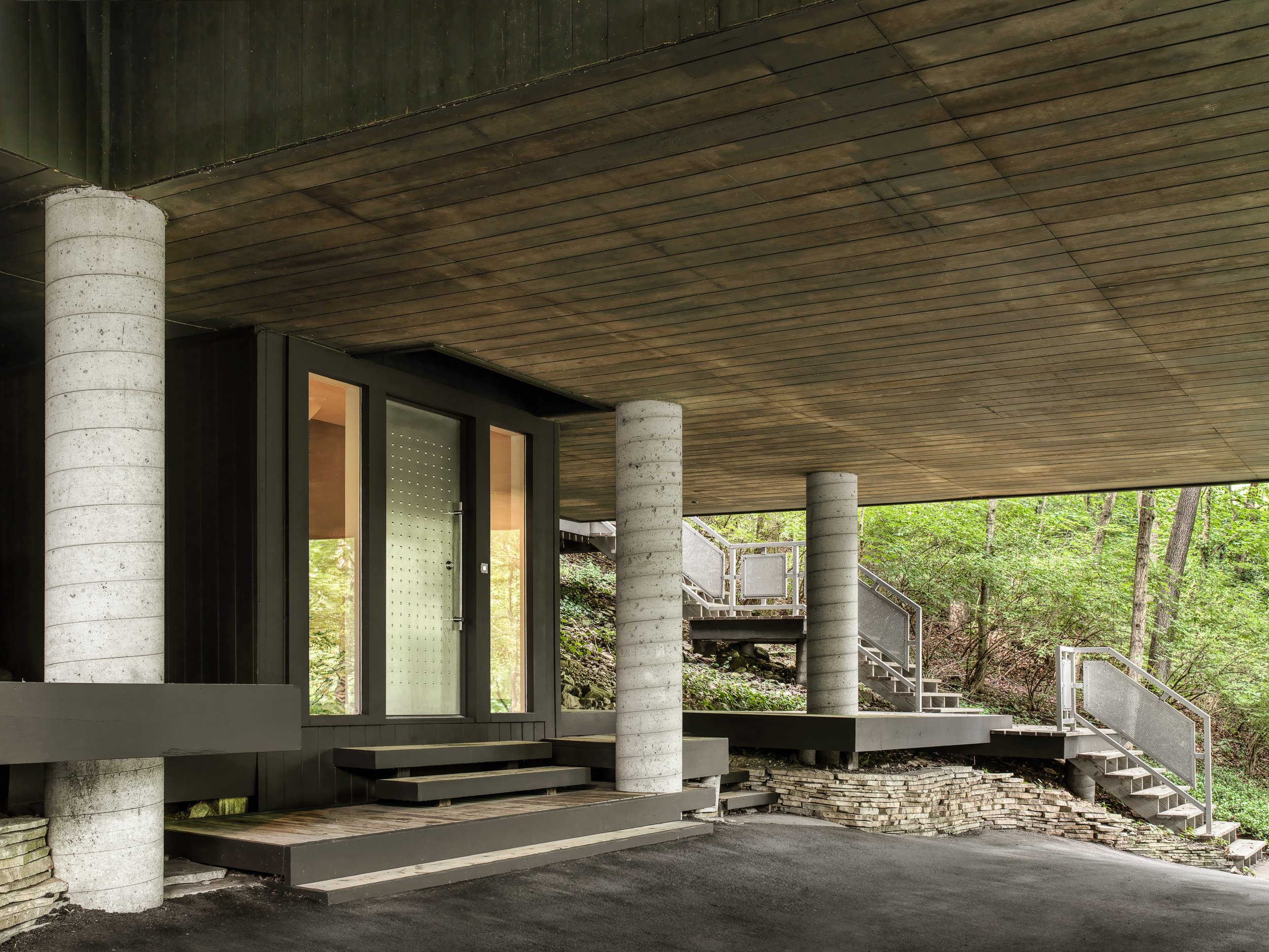
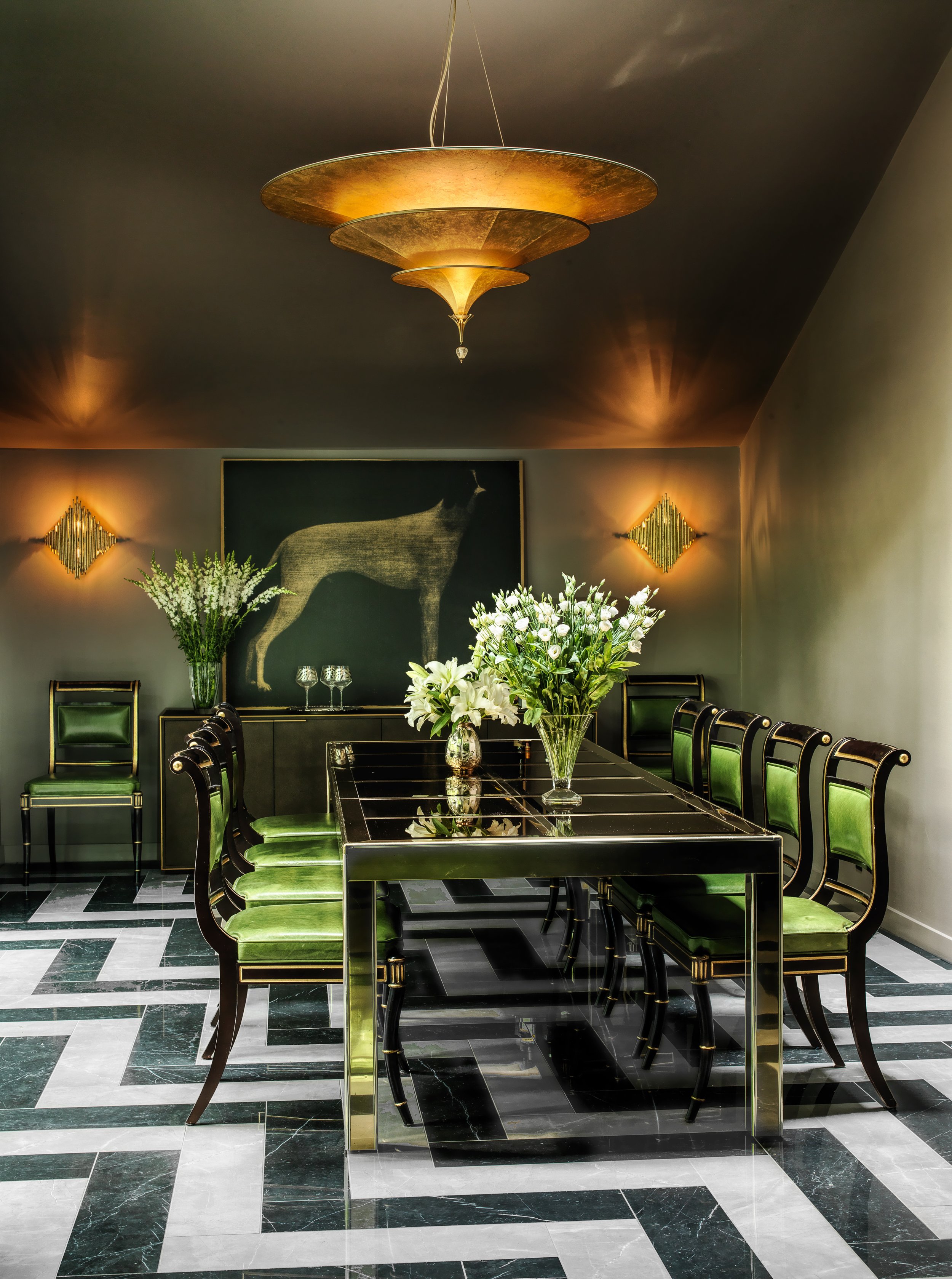
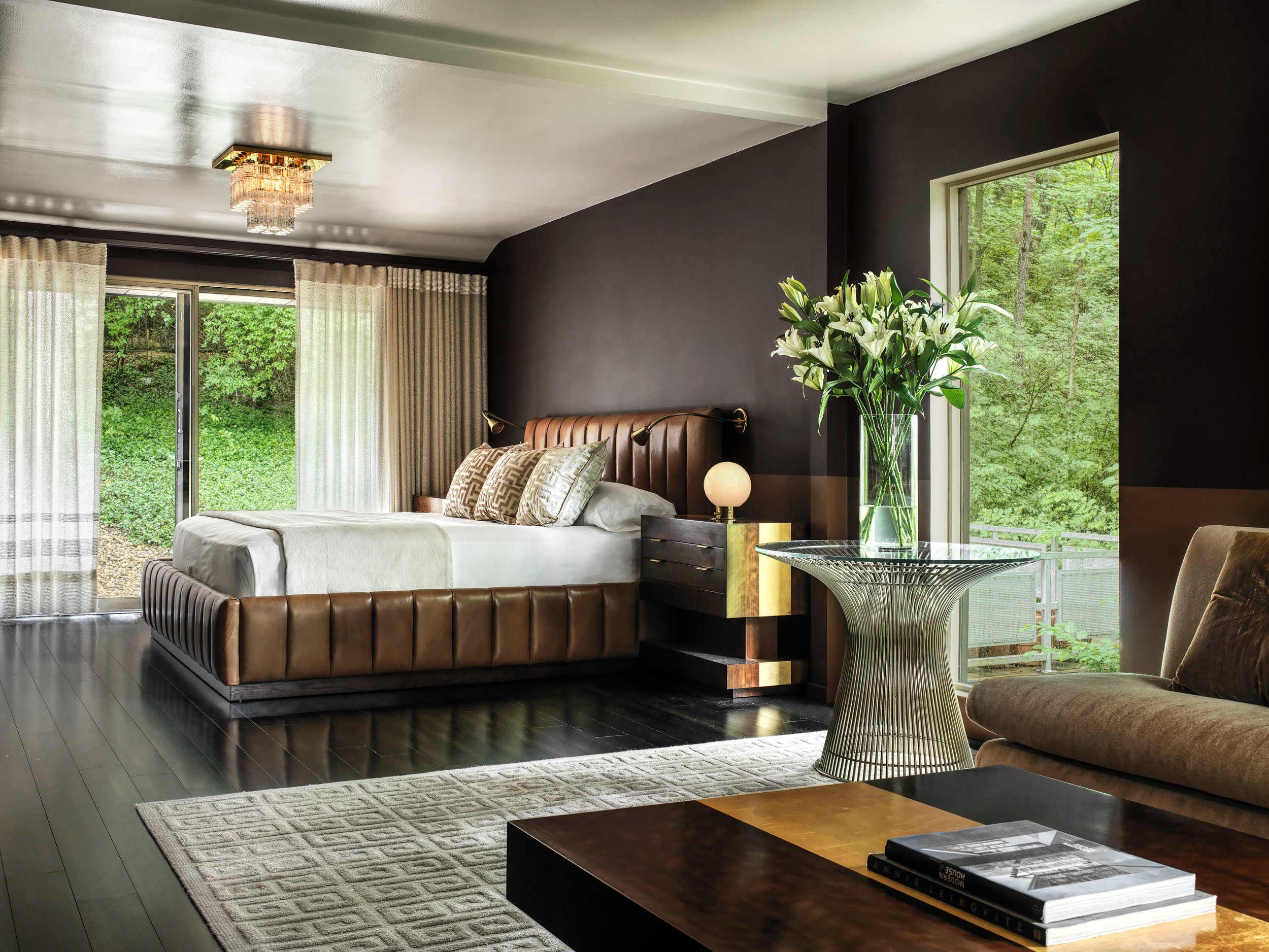
Lush modernist furnishings are contrasted against Brutalist modern architecture. Comfortable Italian modern furniture mixed with classic American mid-century modern pieces as well as moderne antiques soften the lines with soft luxurious fabrics in an autumnal palette to connect to the outdoors. Large scale family entertaining now seamlessly occurs in this 1970s concrete home built in a forest.
Photography by Alise O’Brien
FINALIST Architect: Thomas Wall, Mitchell Wall Architecture & Design
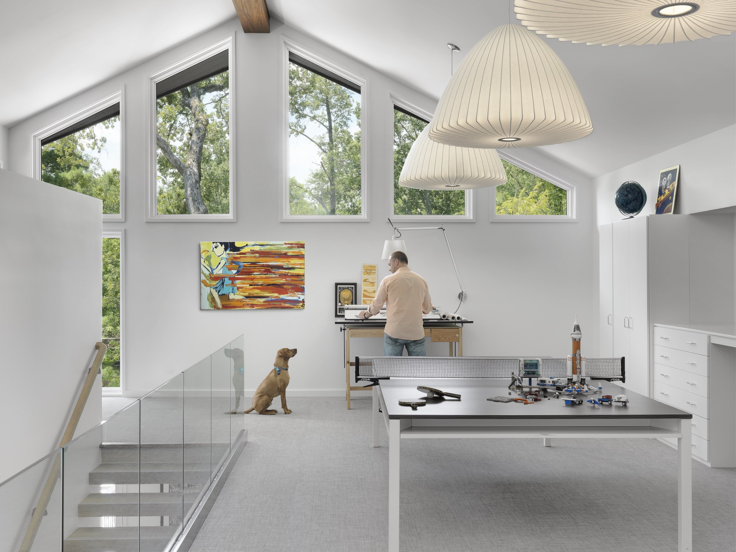
These homeowners always planned to expand their 2,700-square-foot home with an addition. When the husband/architect started planning the addition in 2016, his goal was to create a space that would match the style of the house, while providing a place for storage and room to entertain. The plans included a new master suite, expanded laundry room, a powder room, a second-floor multipurpose room, a guest room with bath, a new basement with a playroom for two young boys, an entertaining space for the grownups, an additional bathroom and unfinished storage space. Once complete, the home was more than 5,900 square feet. The home’s largest family space is the loft-style multipurpose room on the new second floor. The renovation also includes a modern pool and outdoor living area with plenty of space for summer cookouts and entertaining.
Photography by Alise O’Brien Photography
FINALIST Designer: Kim Taylor West, Studio KTW / Architect: Susan Bower, Bower Leet Design
The interior spaces of this modern house are warm, comfortable and inviting. Details include a custom-designed dining table and chairs, home office desk and cabinets throughout. A mixture of clean lines and soft curves work together in a peaceful way. The limestone from the exterior was utilized on some interior walls and the main fireplace. The large kitchen includes three islands and accents of stainless steel. The primary bath features gorgeous green glass tiles and walnut cabinets. Lighting selections enhance all of the spaces and work in hand with the natural light. Window treatments and lighting are on smart home technology systems for ease of use. A mix of textures create a cozy environment in a large home.
Photography by Carmen Troesser
SOPHI Awards Category 2 Residential Interior Design
- Under 3,500 Square Feet
WINNER Builder: Chouteau Building Group / Designer: Amie Corley Interiors
In closing the book on the middle school years, this family home needed a refresh for their high school and college bound children and for the family’s love of entertaining. The desire was to create vibrant and joyful spaces that not only make you want to stay, but make you want to smile. Upstairs, the daughter’s bedroom is calm, charming and tailored to this young woman’s wishes. The en suite bathroom beams with hand cut floor-to-ceiling tile in a checkboard of polished Blue Celeste and honed Thassos marbles. The custom cabinetry is graced with lattice work in harmony with the tile. Unlacquered brass Dash fixtures by Waterworks add a touch of nostalgic elegance. The one-time playroom was transformed into a teen’s entertaining and studying dream room replete with a custom bed nook with a trundle for guests, a built-in desk nestled into the light flooded dormer alcove and a lounge area perfect for cozying up for a movie or a good book.
Photography by Ashley Gieseking
FINALIST Designer: Kelly Johnson, Kelly Johnson Design
For this finished lower level, the client requested a sophisticated, inviting ambience that was light yet moody with a bit of an artistic flair and a space that encouraged everyday small-scale enjoyment, yet gracefully serviced large catered events. The square footage, originally planned to include a service bar, kitchen, gentleman's study and lounge areas, was challenged with the client's request to seat 45 for dining. A bespoke art glass ceiling is the focal point upon entry. A concealed galley kitchen behind the service bar provides support for entertaining. Adjacent to the service bar is a long banquette with bistro tables and barstools. Walls and columns are covered in banana leaf. A bold chunk of backlit blue agate on the wall dramatically echoes the glow of the delicate art glass ceiling. When it's party time, the furnishings play double duty as an oversized sofa table becomes dining for eight, as does a desk in the gentleman's study. Swivel chairs spin around to dine at the short banquette or are paired in couples, all with the assistance of stackable acrylic chairs kept resting in storage along with a portable round dining table for eight.
Photography by Alise O’Brien
FINALIST Architect: Thomas Wall, Mitchell Wall Architecture & Design
In 2014 when George Kaiser donated $350 million dollars to create the world’s largest public park in Tulsa, the surrounding neighborhoods started to change. What was once a blighted area suddenly evolved into a popular place to live. The problem was that not many of the houses were suitable for young families. When we were approached to design this home, we had to accommodate a lot in a small footprint. Creating a three-story home on a diminutive lot presented a lot of challenges. In response, we used as much of the space as possible. The client wanted a two-car garage which we knew would dominate the front elevation, so we had to make sure the entry was profound enough to capture your attention. An open-concept floorplan provides visual connections between the living room, dining room, and kitchen with a two-sided fireplace and custom wine refrigerator defining the spaces. Expansive windows and the introduction of natural elements to the interior truly bring the outside in for this young family.
Photography by Toni Li
SOPHI Awards Category 3 Residential ARCHITECTURAL Design
- Over 3,500 Square Feet
WINNER Architect: Thomas Wall, Mitchell Wall Architecture & Design
The client approached us to design a custom home for them based on the Mid-Century Modern aesthetic. Among other parameters, one element was paramount: They wanted two separate owner’s suites located at different ends of the house from one another and as far apart as possible. It only made sense to develop a plan where each person had their own wing with the common spaces occurring at the confluence of the two. The floor plan for the house was developed from three intersecting planes of stone: one representing the first suite’s wing, one perpendicular to that plane crossing the common spaces and a third running in the same direction as the first extending to the second suite. When you approach the house, the first thing you see is the common plane carrying the cantilevered stairs up to the guest suites on the second floor. This massive wall of stone is perforated with openings providing access to the various spaces. The result is this glorious contemporary home, immaculately decorated and designed with a New Century of Modernism in mind.
Judges’ Comments: “Challenging project. Entry is stunning. Needs of client well met.” “Nice project. You can tell constraint has been used throughout. If I could have seen more exterior images and a plan, that would have been helpful to understand the project.”
Photography by Megan Lorenz
FINALIST Architect: Thomas Wall / Mitchell Wall Architecture & Design / Designer: Tatiana Bilbao, Estudio Tatiana Bilbao / Builder: Emily Rauh Pulitzer of the Pulitzer Arts Foundation in Partnership with Steve Trampe of Owen Development
Inspired by the environmental and social innovation of the traditional dogtrot, this house uses room-sized passages to define private, semi-private and social spaces. On the ground level, the great room of the home is flanked by the bedroom, bathroom and kitchen. The result is a comfortable synergy of public and private space. The great room is defined by its expansive views, an elevated ceiling and a sense of sociability, while the more private spaces offer intimacy. The lower and upper volumes of the house are stacked and rotated,
revealing upper-level outdoor patio opportunities and lower-level shaded porches. The stacked dog trot house allows us to create gradients of privacy which allows families flexibility in ways to use the exterior and interior spaces to simultaneously create a home and connect with the surrounding community. Adjusting the structure of this glorious home to accommodate the extremes of St. Louis weather presented some challenges. For 30 years, the developers of On Olive remained faithful to their vision of an architecturally significant residential neighborhood in the heart of the Grand Center Arts District.
Judge’s comment: “Nicely composed and executed house.”
Photography by Attilio D'Agostino
FINALIST Architect: Derek Hoeferlin, derek hoeferlin design
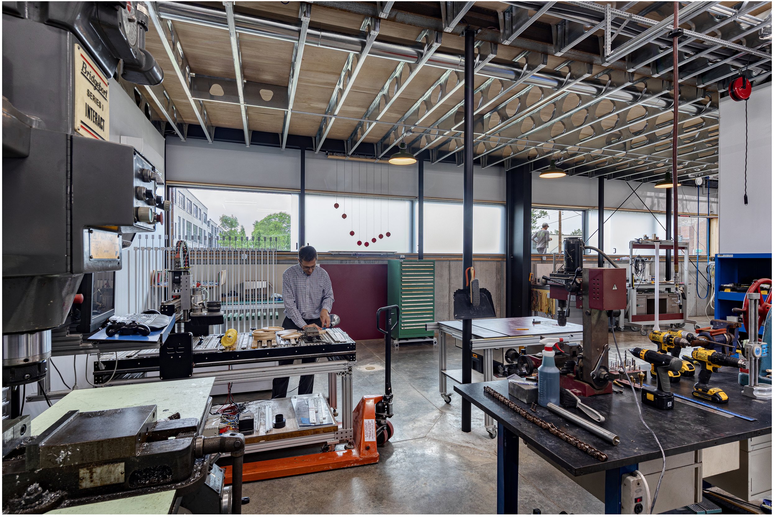
Completed in 2021, the client for this 4,300 square foot live-work studio is an artist who designs, programs and builds kinetic sculptures that are pattern-based in concept. Other than the foundation and superstructure, the client built the majority of the house himself. Uniquely requesting the majority of his house be dedicated to a workshop, it challenges a typical domestic notion of what a large “house” should be. Sited in the Forest Park Southeast neighborhood of St. Louis, the project is constructed as a series of pre-fabricated steel structural bays clad in a weathering steel rainscreen over rigid insulation and metal framing. The material choice of oxidizing steel is a contemporary counterpoint to similar adjacent brick tones. The interior amplifies the exposed large-scale steel structure with a jet-black, gallery-white and galvanized-silver color palette, providing generous double-height work spaces for the client to build and test out his kinetic designs on polished concrete floors. The sculptures are displayed in a copiously daylit-washed front gallery space, set on wood floors economically salvaged from unused 18-wheeler tractor-trailer beds. The more private second floor living spaces contrast the rest of the project with a more domestic concept that is compressed in scale with a colorful material palette.
Judge’s comment: “Great project. It appears to meet the clients’ needs but uses design restraint.”
Photography by Sam Fentress
SOPHI Awards Category 4 Residential ARCHITECTURAL Design
- Under 3,500 Square Feet
WINNER Architect: Thomas Wall, Mitchell Wall Architecture & Design
In 2014 when George Kaiser donated $350 million dollars to create the world’s largest public park in Tulsa, the surrounding neighborhoods started to change. What was once a blighted area with families choosing to live elsewhere suddenly became a popular place to live. The problem is, not many of the houses there are suitable for young families. Creating a 3-story home on a diminutive lot presented a lot of challenges. In response, we used as much of the space as possible. The client wanted a 2-car garage which we knew would dominate the front elevation, so we had to make sure the entry was profound enough to capture your attention. An open-air third-story patio with a cantilevered corner provides views heretofore unavailable in the area. An open-concept floorplan provides visual connections between the living room, dining room, and kitchen with a two-sided fireplace and custom wine refrigerator defining the spaces. With three bedrooms on the second floor, we were able to use the entire third floor to create a primary suite with an elegant bathroom and separate walk-in closets. Expansive windows and the introduction of natural elements to the interior truly bring the outside in for this young family.
Judges’ Comments: “Attractive and effective space planning, really taking into account the requirements and challenges of the building site. Warm and inviting modern home.” “This is a stunning project? Very impressed and beautiful. I don’t know the clients’ goals but I can’t imagine they weren’t met.”
Photography by Toni Li
FINALIST Builder: Pat Sommer / Fischer and Frichtel Homes
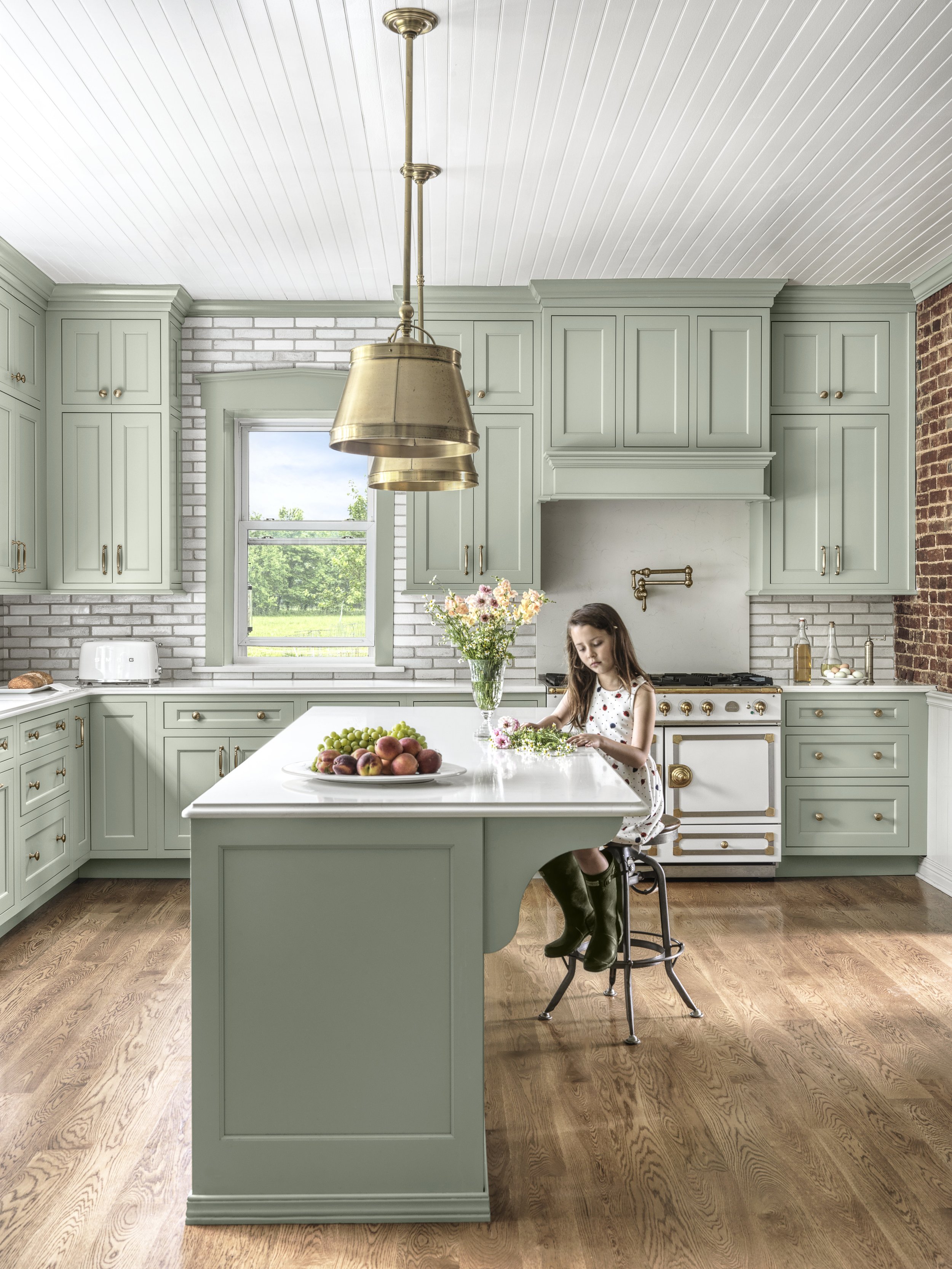
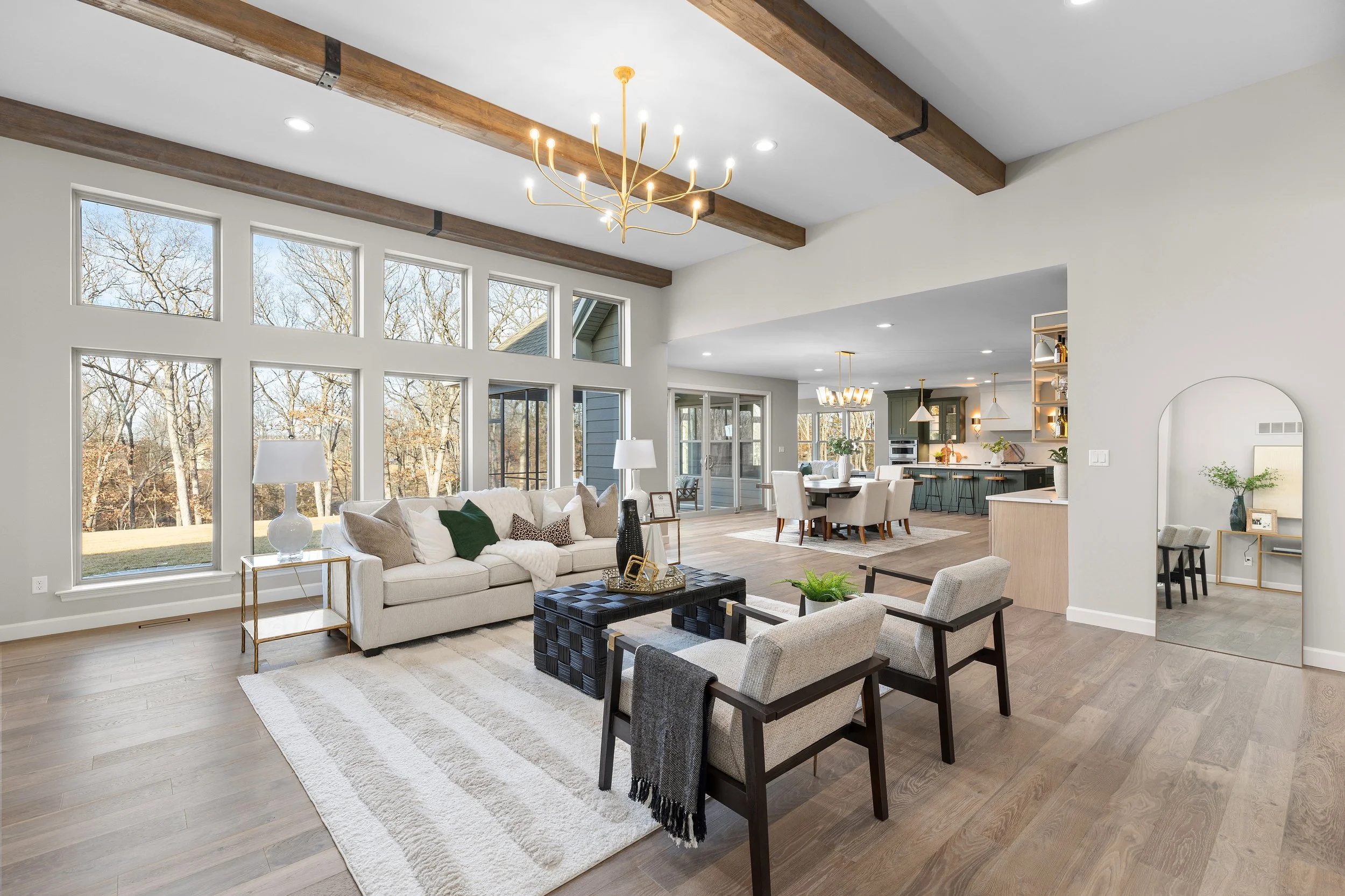
The builder purchased a 120-acre, park-like piece of land in St. Charles County to develop into a new home community with 32 homes on multi-acre homesites. The mission was to build a display home that would best illustrate life in this strikingly unique community. However, it was a balancing act to build a home that would showcase estate living in the woods, while making sure it could be used as a display center. The spacious Nantucket ranch with three-car, side-entry garage seemed like a natural choice. The design team chose a light color brick and stone exterior and placed it on a 3-plus acre, corner lot, which was landscaped as a large, level yard backing to an existing wooded area. The first thing visitors notice when they enter the home is the wide-open floorplan and 12-foot ceilings in the great room and dining room. The kitchen is connected to a hearth room with a vaulted ceiling and a large breakfast area with a spectacular built-in breakfast bar/wet bar. On the other side of the breakfast area, a glass wall with sliders opens to a spacious screened in patio. The main floor also includes a private study, luxurious primary suite, two guest bedrooms, laundry room, family foyer and cook's bath. All are adorned in a neutral color palette with tides of light-colored wood grain.
Judges’ Comments: “Creative and welcoming plan for the sales center. Really liked the use of color in the kitchen. Floor plan is flexible and is well situated for ‘estate living in the woods’ with more urban amenities.” “I really like the green cabinets.”
Photography by David Hughes
FINALIST Architect: Thomas Wall, Mitchell Wall Architecture & Design
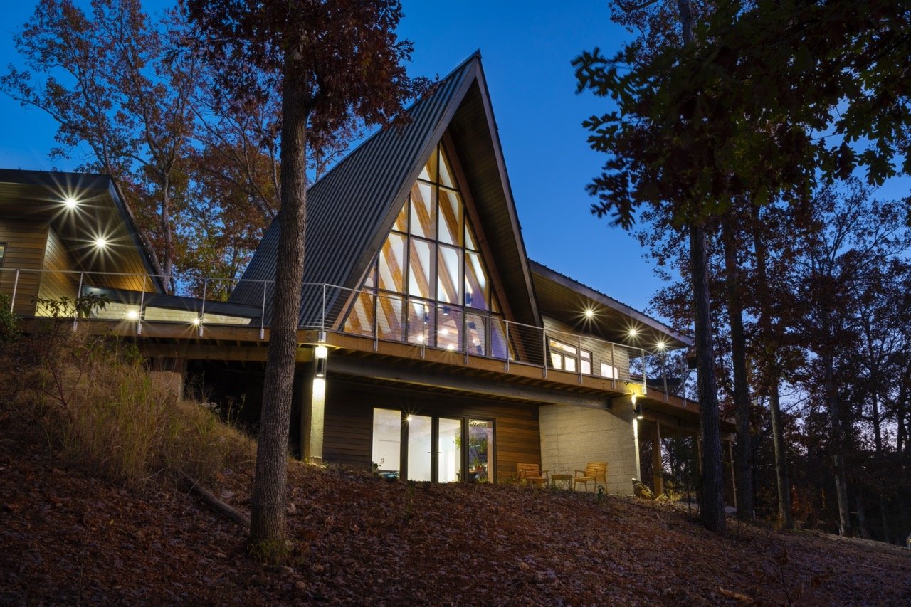
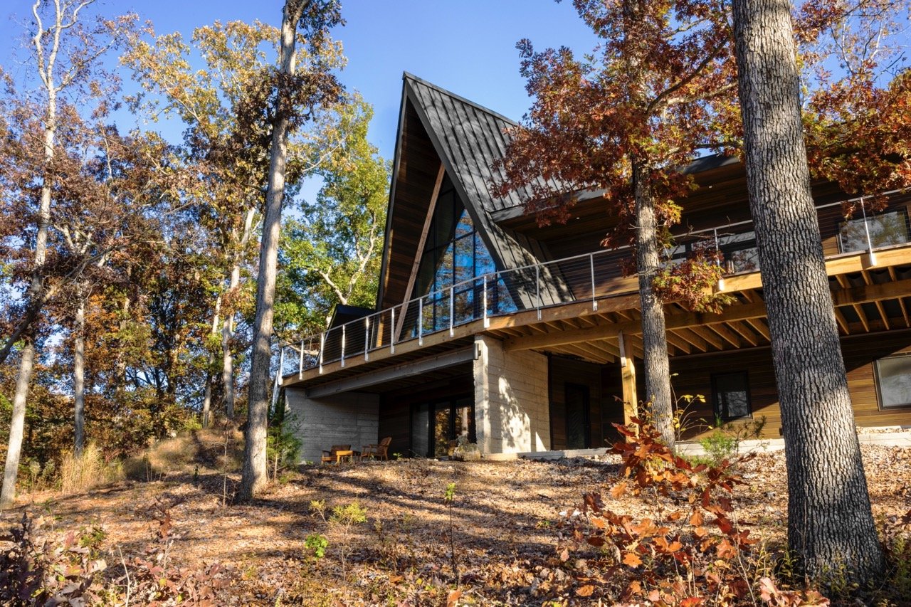
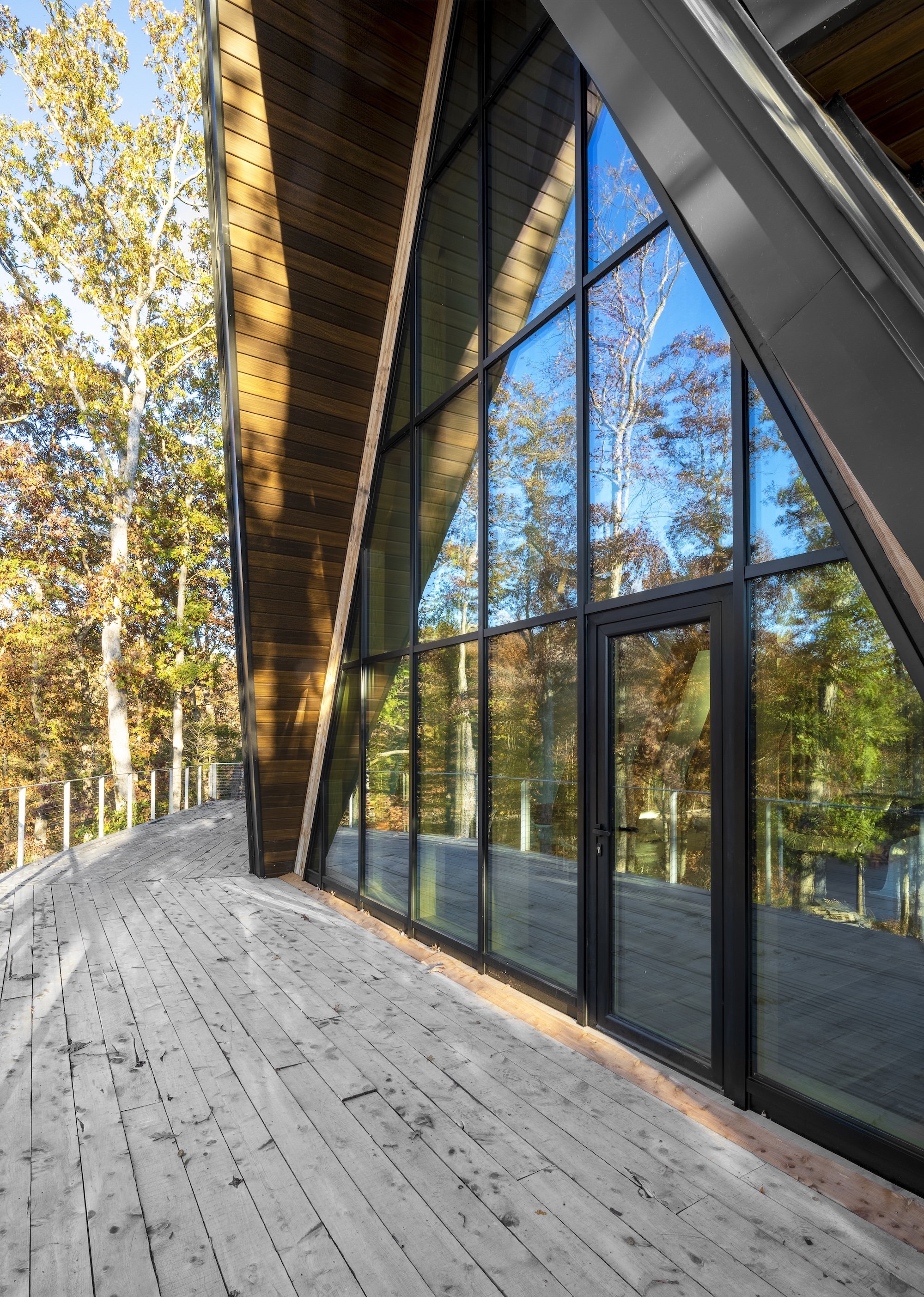
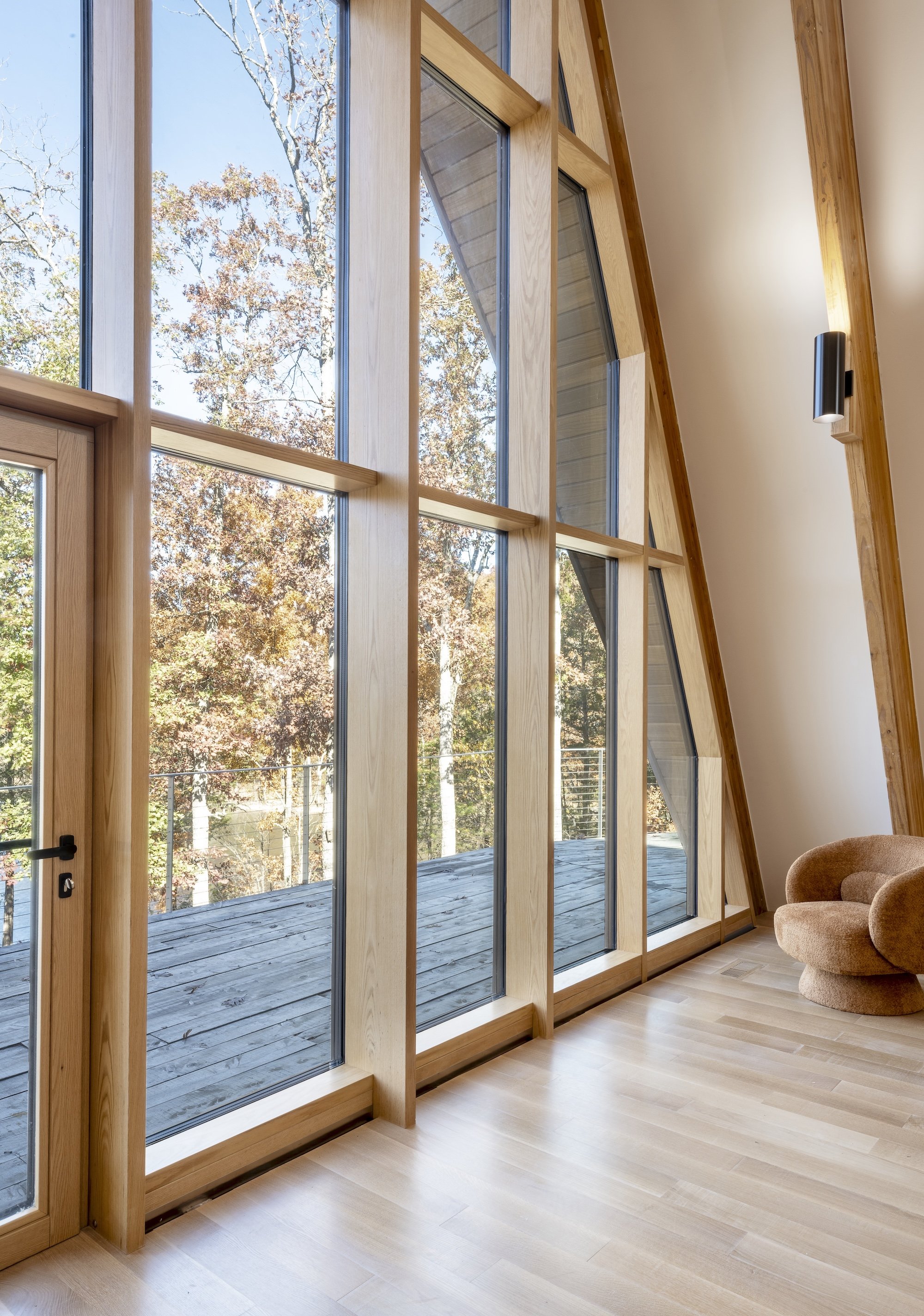
Nestled within the tranquil embrace of a secluded forest on the shores of a serene lake, this contemporary A-Frame emerges as a harmonious blend of modern architecture and rustic charm. A bold departure from its traditional counterparts, this home boasts wings extending outwards and angling back to embrace the panoramic views of the surrounding nature. Floor-to-ceiling windows line the front and back, allowing natural light to cascade into the open living space and offering uninterrupted vistas of the lake, while the steeply pitched roof ensures the gentle patter of rain resonates through the cozy interiors during storms.
Judge’s comment: “This is a beautiful exterior home. I would have loved to have seen more of the interior and to learn more about the project and goals of the client.”
Photography by Alise O’Brien
SOPHI Awards Category 5 interior design singular space: bedroom
WINNER Designer: Lauren Sweet-Schuler, Studio Sweet-Schuler
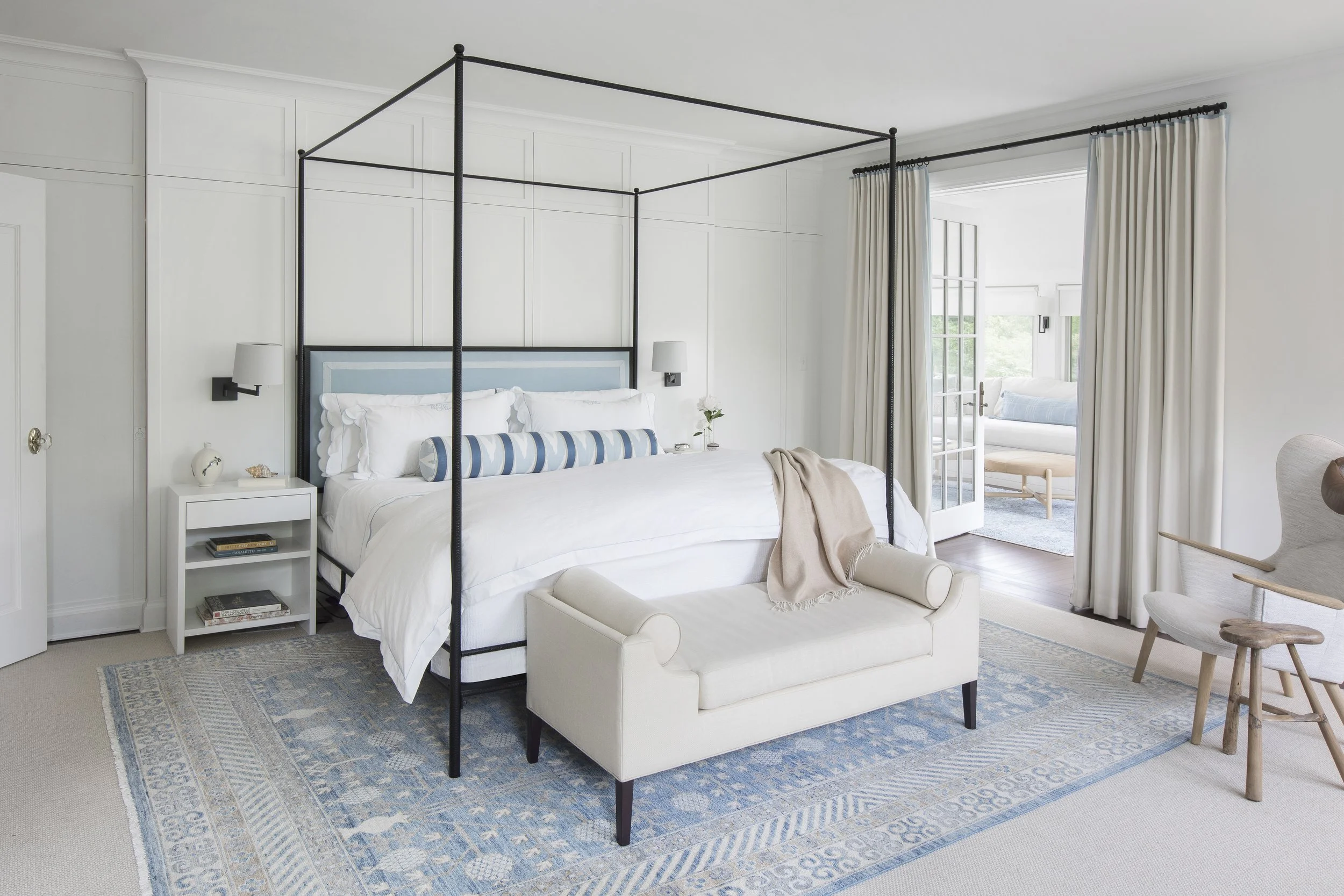
Drawing inspiration from their summer house in the Hamptons, the client wanted a primary suite that combined the blue and white traditional likings of one partner with the contemporary style of the other. In the center of the room sits an iron canopy bed in front of a custom-paneled wall to create a soft grid and focal point. Embroidered custom Matouk bedding and a custom bolster sit against the custom upholstered headboard with tape border. Vibia wall-mounted swing arm sconces offer reading light by night, and beautiful lines by day above the custom made beside tables. Left and right of bedside tables are hidden his/her closet doors with the same paneling and base. The custom wool drapery has a soft blue stitched flange on the top and leading edge that continues the hints of blue from around the room. Across from the bed are "his/hers" auxiliary pieces. For her, a custom designed make-up vanity of maple with a spun prominent leg detail, a radius marble top and Ghost chair from Kartell provides a beautiful soft space for pampering. For him, the Mama Bear chair in a Weitzner textile with leather head pillow and bronze floor lamp by Vaughn with an antique Chinese stool adds a casual lounge space to read or play the guitar. Anchoring the traditional bed and modern chair is a one of a kind blue and white woven Oushak pattern rug. French doors open to an en suite sunroom with windows on three sides. This space was designed to reflect their beautiful Hamptons home, and be a place to relax in a sun-filled escape. A custom built-in bench with open storage underneath, as well as touch-latch drawers for hidden storage provides daybed seating with custom cushions and a mix of blue and white pillows for relaxed Hamptons home feel.
Judge’s comment: “Lovely, sophisticated, smart blend of styles.”
Photography by Megan Lorenz Photography
FINALIST Designer: Ashley Obradovits, Karr Bick Kitchens and Baths
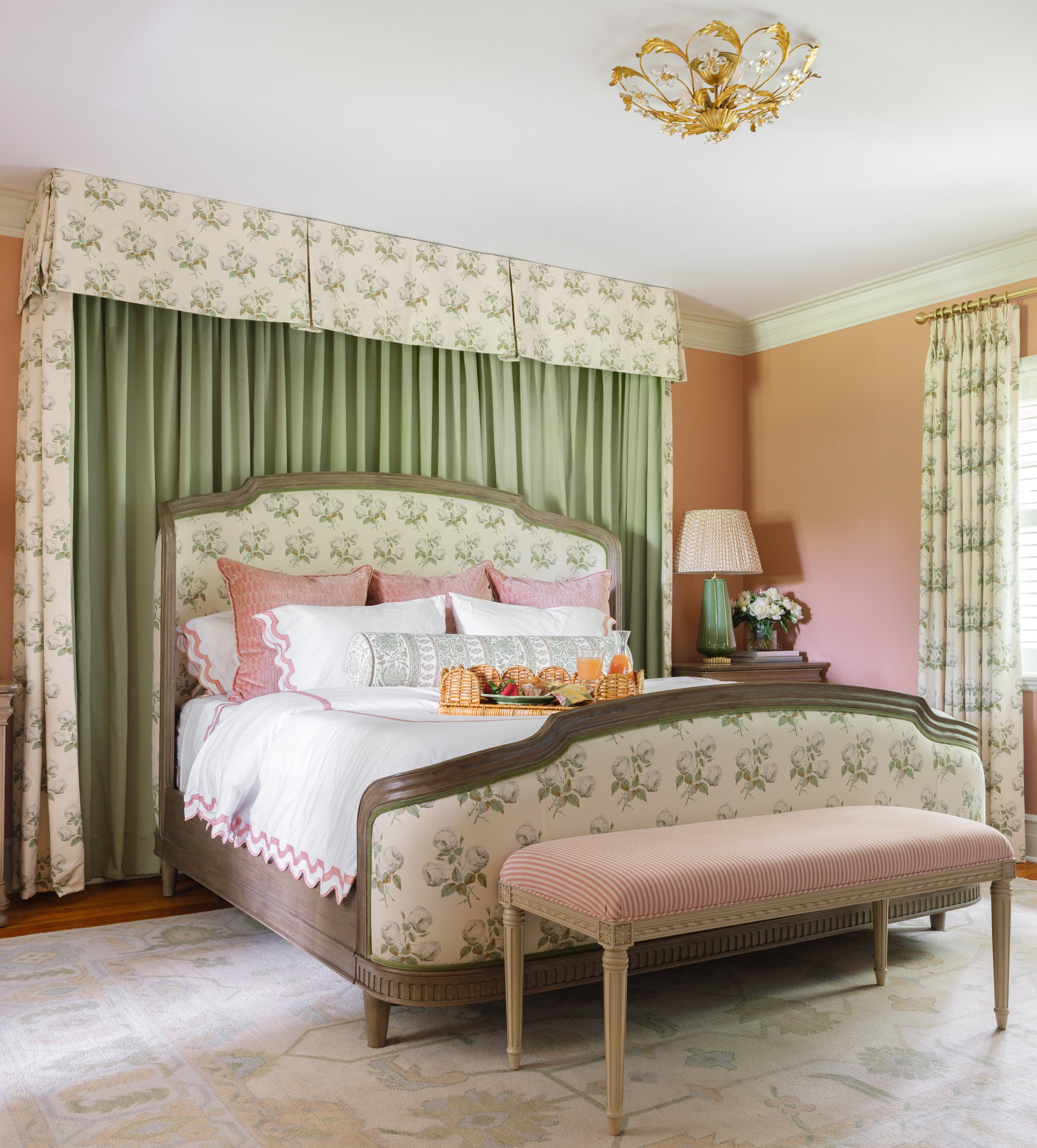
The goal in this stunning bedroom was to create an oasis for our clients that was filled with elegance and romance. This “Bridgerton” inspired primary suite combines the perfect blend of textures and finishes. We were very selective with the color palette. First, we chose the main hues, which include pale blues and greens, soft corals, delicate florals and creamy whites. Adding a touch of deep coral in a textured velvet adds depth and sophistication and ties to the wall color. The custom canopy is the star of the entire space with its elegant floral fabric, lined in the loveliest shade of green. It frames the upholstered headboard flawlessly. Each piece of furniture was chosen to reflect the age of the home, but with an added modern flare. The timeless lighting, striped bench, gold-accented dresser, and gilded mirror all add the perfect ambiance. We are certain that we’ve taken breakfast in bed to a whole new level.
Photography by Lisa Mitchell
FINALIST Karen Korn, Karen Korn Interiors
My clients live in a historic home and it is imperative to them that they honor its architecture and heritage. We were tasked with using an heirloom rug and a couple of antique tables in their bedroom. The rug served as our color inspiration and we sourced furniture styles and patterns that were reminiscent of the past while allowing the room to feel refreshed.
Photography by Karen Palmer
SOPHI Awards Category 6 Residential InterioR Design: kitchen
WINNER Designer and Builder, Bobby Slavin, Slavin Homes
The entire house was a gut rehab. Two structural beams were added to accommodate an oversized Ann-Morris pot rack in the center of the room. The English scullery kitchen design was inspired by British designer Christopher Peacock. One wall is cabinetry, made by Plato Woodwork of Plato, Minn. The Viking 10-burner stove is backed by marble subway tiles. The bespoke hardware protecting the wood corners of the walnut butcher block was produced by Wilmette Hardware, Ill. The breakfast nook features a banquette bench made in Chicago and covered in a Holly Hunt leather, and a classic Saarinen Tulip table. The walls were covered in a walnut cove paneling discovered the design in the St. Ambroeus, a restaurant in New York.
Photography by Alise O’Brien
Photography by Alise O’Brien
FINALIST Designers: Kelly Johnson, Kelly Johnson Design /Jim Howard, Alspaugh Kitchen & Bath / Builder: Sitelines
The design objectives centered around celebrating the large area with 12-foot ceilings, enhancing exterior and adjacent interior views and maximizing functionality and storage while balancing proportion and symmetry. The challenge of limited wall space was resolved through the creation of standalone cabinet forms. These forms compensate for the scarcity of walls and serve as pieces of functional art. Each standalone unit addresses distinct needs, bringing together an ensemble that befits both gatherings and daily family life. The cooking hearth is enveloped in black oak paneling with a bevel edge encompassing a 60-inch range, microwave and convection steam oven, all concealed behind its façade. Its counterpart, the cleanup/prep Island, boasts a workstation-style sink, dishwasher and trash cabinet. A raised dining table-cum-island seats five while also housing a warming drawer. The crown jewels of this design narrative are the Hutch Islands. The tall Hutch Island bridges the divide between the kitchen and living room, offering Butler pantry storage on one side and a refreshment bar. The pantry wall was framed in with pocket doors, blending its function with the surrounding design elements.
Photography by Alise O’Brien
FINALIST Designer: Deb Vuagniaux, Karr Bick, Builder: Barco Construction
This kitchen remodel was truly a transformative project. Our intent was to give this family a place to cook and entertain with a beautiful and functional design. Being an older, historic home, it had nine different doorways leading into the kitchen area. So, we needed to be thoughtful and creative with the new layout. First, we eliminated several of the doorways to allow for more cabinetry and removed an awkward back staircase to maximize the square footage. Then we added all new cabinets lining two of the walls, as well as an island to form a center peninsula, which added incredible function and openness to the space. Our next challenge was to maintain historic character, while modernizing the space. We chose a timeless color palette and finishes that stayed true to the age and style of the home and added all new appliances for the resident chef. The full height marble splash adds a bit of luxury, but also feels like it's been there forever. In the end, this remodel was thoughtfully executed to create a space that’s not only beautiful but also highly functional for entertaining, which was exactly the goal of the entire project.
Photography by Lisa Mitchell
SOPHI Awards Category 7 Residential InterioR Design SINGULAR SPACE: BATH
WINNER Designer April Jensen, ADJ Interiors, Architect: Fendler + Associates / Builder Priffi Construction
Part of the second phase of a whole home renovation, the original primary suit was dated and small. We were tasked with expansion of square footage, but also creating a serene respite that included a bedroom and primary bath to match the grandeur of the rest of the home. With a spa-like color palette, tile on all the walls, custom mirrors and cabinetry, glam finishes and the use of multiple textures, the primary bedroom and bathroom provide an escape from the world.
Photography by Alise O’Brien
FINALIST Designer: Lauren Sweet-Schuler, Sweet-Schuler Studio / Architect: Jenny Gossow
Stepping into this bath is like stepping into a luxury hotel suite. Every turn has modern amenities with traditional fixtures to create a space that is relaxing, elegant and understated. The first view is of the beautiful Waterworks cast iron bathtub with wall-mounted polished nickel tub filler, also of Waterworks and art from the homeowner’s personal collection, against a white marble wall. The custom walnut floating vanity in a graphite stain has integrated pulls and creates great contrast to the soft white stone and walls. The Robern medicine cabinets have a custom-designed walnut frame, with a built-in transom and mirror to match the glass transom above the bathroom door. Waterworks faucets in polished nickel and petite sconces by Flos add a formality and traditional feeling to the modern lines of the vanity elevation. The zero-entry shower for two continues the same floor that is in the main bath, but in a smaller tile for a seamless transition. The dual shower allows each user to select their preferred shower pieces by Waterworks for a truly custom luxury shower experience.
Photography by Megan Lorenz
FINALIST Designer: Janelle Helms, Karr Bick Kitchen + Bath
Our clients wanted to add an entry from the primary bedroom to their existing hall bath. This would allow them to use it for an en suite and guest bathroom. We did this by shifting the hall door to the center of the entry to allow for large vanities on either side of the door. The new plan allowed for a separate toilet room and spacious shower opposite the vanity wall.
In addition to changing the layout they wanted to update the finishes while staying true to the age and style of their home. The walnut cabinetry, marble countertops and brass plumbing fixtures achieve this by adding elements that are just as beautiful today as they were a hundred years ago. The green tile that is carried throughout the space is the perfect pop of color. The black and white patterned floor tile along with the floral and caramel wallpaper combination all came together to allow us to create a truly lovely bathroom.
Photography by Lisa Mitchell
SOPHI Awards Category 8 Residential InterioR Design SINGULAR SPACE: CHILDREN’S ROOM
WINNER Designer Kelly Johnson, Kelly Johnson Design
Designed for identical twin girls, this bunk room at the family's farm is their home away from home most weekends. The clients requested a room that would serve as both bedroom and playroom, include ample storage and reflect their daughters’ carefree personalities. The only restriction was to avoid the use of pink or purple, as each color is used exclusively to identify each of the twins. A playful wallpaper adorned with multi-colored cats establishes the whimsical tone of the room. The bunk beds and trim throughout the room are painted the same shade of vibrant blue as the "blue cat" and included integrated drawer storage in the bunk steps and frame. The cat wallpaper is complemented by multi-colored polka dots on the bedding and rug. Sunshine yellow draperies are accented with multi-colored pom-pom trim, also applied on a lampshade. Wooden cat chairs serve as functional decor at the craft table and a mirror resembling a string of pearls hovers above the dresser. The end result is a delightful blend of childlike wonder and practical design in a setting that feels both magical and grounded.
Judge’s comment: “What a dream! The bunk bed of all bunk beds. Perfect for reading a story at night or having friends over. The use storage in the steps is brilliant, as is the custom-recessed lighting. Love that it’s not overly girly but instead whimsical, charming and secretly very practical. Stellar.”
Photography by Alise O’Brien
FINALIST Designer: Ashley Obradovits. Karr Bick Kitchen & Bath
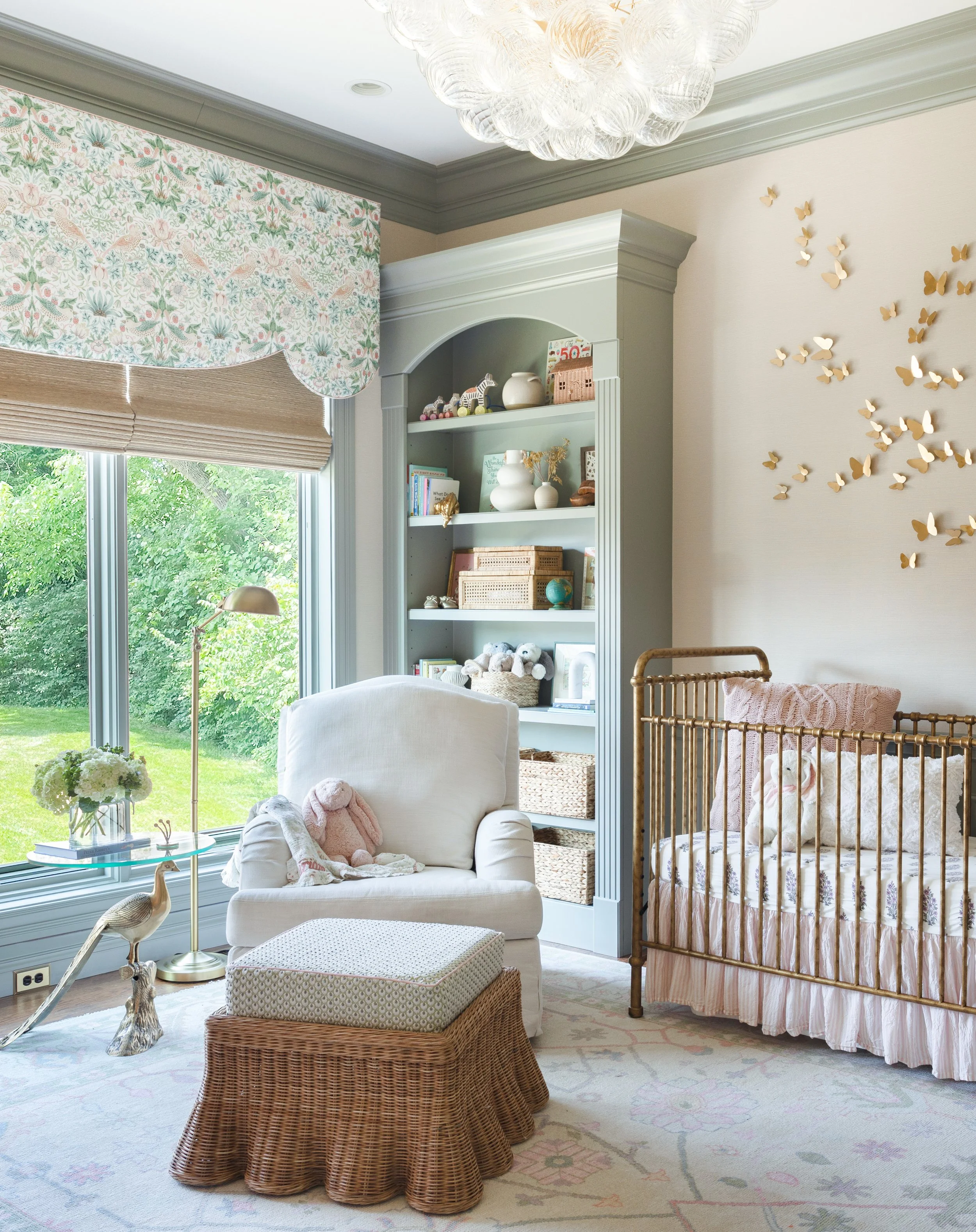
The transformation of what was formerly a dark home office into a stunning nursery is a heartwarming and creative project that met the needs of our clients. The expectant parents needed a nursery close to their first-floor master suite, which led to the conversion of the existing office. However, creating an entrance between the master suite and the office required some creative thought and was collaborated on with our construction team to successfully ensure easy access to the nursery. We wanted to infuse the room with texture and beauty, but also allow it to The transformation of what was formerly a dark home office into a stunning nursery is a heartwarming and creative project that met the needs of our clients. The expectant parents needed a nursery close to their first-floor master suite, which led to the conversion of the existing office. However, creating an entrance between the master suite and the office required some creative thought and was collaborated on with our construction team to successfully ensure easy access to the nursery. We wanted to infuse the room with texture and beauty, but also allow it to be a space where this little one can grow into. The use of grass cloth wallpaper on the walls added texture and sophistication to the space without overwhelming it. We painted the dark molding a soft green paint to complement the overall look. The bubble light gives a touch of glamour. The butterfly art above the crib serves as a unique and captivating focal point. Every fabric, piece of furniture, and decor from the changing table to the custom rug, was carefully chosen to ensure the nursery is not only beautiful but also practical . The design was created with an eye toward longevity, allowing the family to enjoy the nursery for many years to come.
Photography by Lisa Mitchell
FINALIST Designer: Joni Spear, Joni Spear Interior Design
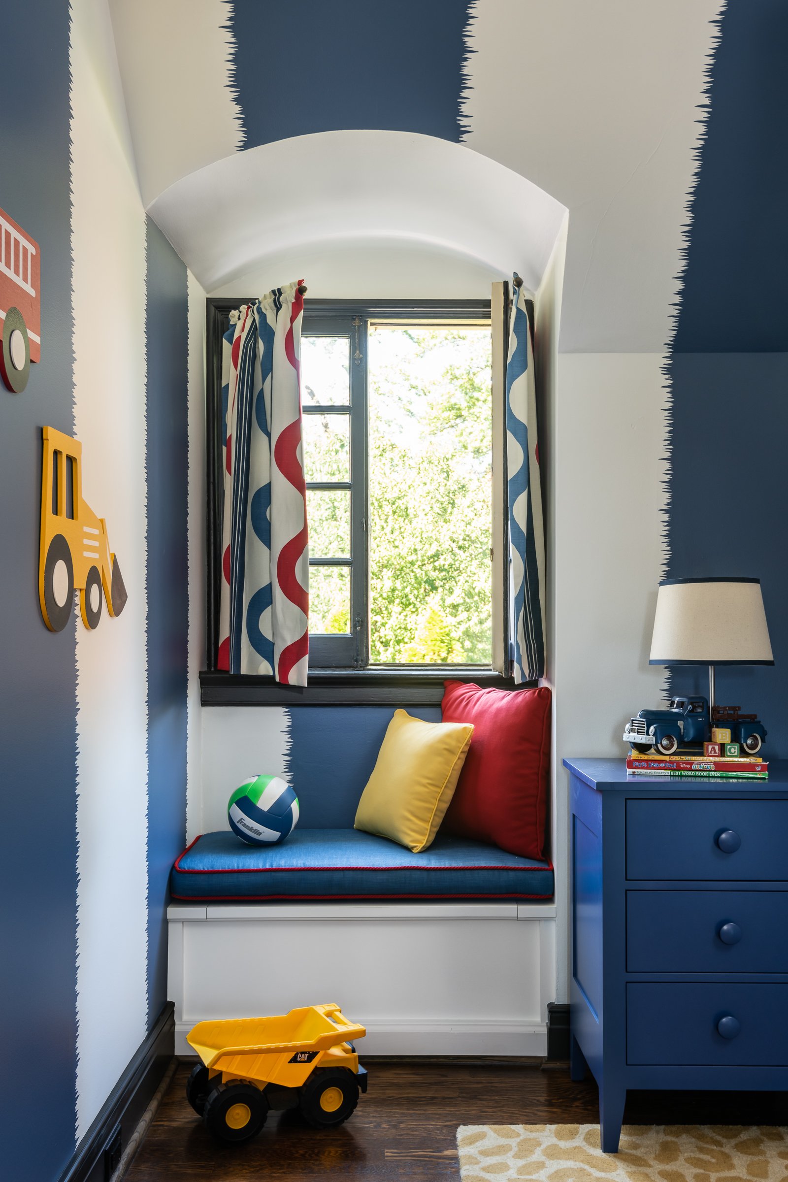
The existing office had no door and was located at the end of a long dark hallway that had been painted black by the last homeowners. First order of business was to lighten the hall and create a wall space for functioning doors. The awkward architecture of the room with three alcove windows, slanted ceilings and built-in bookcases proved an inconvenient location for furniture placement. We opted to place the bed against the wall so the two-year-old wouldn’t fall out. The solid wood bed and nightstand were constructed in the U.S. and painted in vibrant shades to match the bedding and custom roman shades. The amazing irregular wall stripes were inherited from the previous homeowner but were also black and proved too dark for a toddler. Both myself and the client loved them and decided to have them re-painted in a daring blue. The fabric used on the windows counterbalances the wall stripes. Window seats and a built-in toy storage were constructed to make use of the alcove windows. Now, the room is not only fun and bright, but functional.
Judge’s comments: “Bold and cool. Nice problem solving with a few space concerns. Will be great for the kid to group up, just change a few accessories like the truck details, and it’s still a room to grow older in. Love that the furniture was U.S.-made; smart custom details.”
Photography by Karen Palmer
SOPHI Awards Category 8 Residential InterioR Design SINGULAR SPACE: DINING ROOM
WINNER Designer: Morgan Brown, Emily Castle Design
It’s said that an all-neutral space can be one of the toughest to design. That clearly wasn’t an issue with this project, as the homeowner wanted to lean into the monochromatic idea and all it has to offer. The vision was clear and simple: Create a neutral, family friendly space and environment for both family and friends to enjoy. Both the homeowner and the designer worked seamlessly together, bouncing ideas off one another, to make this vision come to life. Layers upon layers of varying hues of creams encompass the space while subtle pops of greys and blacks in the finishes were selected to break it up and add depth. Texture was something the homeowner mentioned she loves and wanted to highlight in the space, so selecting fabrics such as linens and velvets were important. From the textured upholstered dining chairs to the natural rug and the hand-woven wallpaper, a sense of warmth and richness is created. The light oak dining table, brass details in the accessories and lighting and green glassware and plantings all bring touches of the surrounding environment indoors. Thoughtful choices in the neutral color palette, layered textures and subtle touches and nods to the outdoors, helped create a calm and comfortable environment that the homeowners, and their guests, can enjoy for years to come. The initial vision may have been simple; however, the end result is simple yet significant.
Judge’s comments: “This is lovely. Neutrals done flawlessly and with warmth.”
Photography: Alise O’Brien
FINALIST Designer: Kelly Johnson, Kelly Johnson Design
The objective for this generously sized dining room was to create a dramatic yet inviting space that radiates a blend of elegance and luxury. A standout feature of the room is the hand-painted floral mural, graced with glistening metallic botanica. The mural, in soft lavender tones complemented with gold, bronze and cream accents, dominates the color palette for the room. Intricate ceiling moldings add architectural interest, while the cascading chandelier of glass orbs creates a contemporary and opulent focal point. Whiskey-colored velvet dining chairs harmonize with the golden bronze metallic accents in the wallpaper as do the cognac-colored silk accent threads in the abstract patterned rug. Soft metallic accents are repeated in the paired chests and mirrors at the end of the room. The finished space intertwines traditional elements with a contemporary flair, resulting in a room that is fresh, invigorating and sophisticated.
Photography: Alise O’Brien
FINALIST Designer: Amy Studebaker / Amy Studebaker Design
Olive Avenue's dining room exudes an approachable elegance that creates a comfortable, elevated experience for any dinner guest. Rich velvet tones anchor the space's traditional interior when unexpectedly paired with a coral, lacquered hutch and timeless brass lighting.
Judge’s comment: “Gorgeous. Lovely use of fabrics and furniture. Must be so fun to host here. Love that it’s right off the kitchen, where everyone wants to be!
Photography & Styling: Max-Kimbee, Natalie Warady
SOPHI Awards Category 10 Residential InterioR Design SINGULAR SPACE: LIVING ROOM OR GREAT ROOM
WINNER Designer Kelly Johnson, Kelly Johnson Design
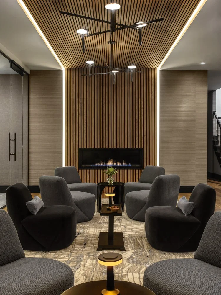
The swanky, sexy speakeasy in this home is a destination of its own. Upon descent, guests are enveloped in a dark, moody blue retreat where every surface has received attention to detail. The first focal point is a chic bar finished in glossy peacock blue with a scalloped front and black granite waterfall counter. Petite polished nickel lamps grace the countertops, posh blue-velvet barstools line the bar face and dim ambient lighting bathes the space in twilight. Blue-gray raffia wallcovering adds dimension to the walls extending into the wine lounge where an acoustical wood-slatted ceiling warms the room and introduces a linear texture that cascades down the fireplace wall, contrasting with the softer, rounded shapes of the furniture. Spanning the length of the glass-walled wine cellar, sleek blue and black furnishings are arranged in three cozy groupings on top of a linear abstract rug for sips of Chardonnay and shared secrets. Just beyond the whisper is a viewing area with motorized, convertible seating, blue-velvet walls and architectural sconces. A peacock-and-black powder room continues the mood of this alluring space.
Judge’s comments: “Brilliant project! Well done!” “Extremely well done and well executed modern living space. The cohesive and crisp and warm and inviting spaces flow seamlessly together. The overall essence is luxe, and it is beautiful.”
Photography by Alise O’Brien
FINALIST Designer: Laurie LeBoeuf, Emily Castle Design / Architect: Schaub Projects Architecture & Design / Builder: Andrew Singer
Recalling the golden days of Hollywood, this stunning lower-level bar and lounge pays homage to the glamorous and sophisticated interiors of the silver screen. Here, the stage is set with a beautiful curved bar clad in a fluted black tile, complemented by dark forest green walls, and topped with a deco inspired countertop and perforated brass lighting. Rich furnishings, like the bold black leather and brass barstools wrapping the bar, create a centerpiece worthy of everyone’s attention. Once an unused storage space, the design team worked together to create a layout separating a family friendly movie, snack bar and bunk room area with a separate hidden speakeasy lounge fit for fun and entertaining. Challenged with creating a cohesive plan, all while designing a distinct separation between the desired usage of space, the designer set out to provide the homeowner with a new fully finished and functional lower-level design for all ages to enjoy. The color palette, gold and glass sconces and velvet upholstered furniture helps get the atmosphere just right. A custom upholstered banquette built by Jente Woodworking serves as comfortable place to gather, accomplishing an end-result that feels exactly like the Art Déco hideaway the homeowner desired.
Judges’ comments: “This is done really well! The colors are so rich and the space is moody. Fantastic job!” “Sexy and moody bar vibe, with rich deep colors that seem to hit the client’s requirement perfectly.”
Photography by Alise O’Brien
FINALIST Designer: Ellie Redders, Ellie Redders Interiors / Builder: Chris Susic, IAF Remodeling
This room was previously a traditional dining room but it was rarely used. The homeowner wanted a space that was more functional for their family and also created a curated, fun and interesting mood. Focusing on their love for music, an antique piano became the primary focus with a large crystal chandelier anchoring the space. The walls and ceiling were lacquered in a rich hue with matching drapery that set the mood of an old piano bar. Art is framed throughout the space in various shapes and sizes that add interest and texture. Whether playing the piano, or just relaxing with a cocktail, this space has become the perfect, versatile space that the homeowner dreamed of.
Judges’ comments: “This is a lovely project. The colors are perfect.” “Thoughtful and attractive repurposing of a rarely used space into a destination.”
Photography by Megan Lorenz Photography
SOPHI Awards Category 11 Residential InterioR Design: use of small space
CO-WINNER Builder: Chouteau Building Group / Designer: April Jensen, ADJ Interiors / Architect: Fendler + Associates
Being an avid gardener, the homeowner needed a space to care for his large collection of orchids and house plants. The existing sunroom was transformed into a functioning greenhouse. The brick was limewashed to match the exterior of the home. The existing doors and windows were painted in Sherwin Williams’ Caviar to harken the feel of vintage ironwork and to add a strong contrast to the soft colors and marble flooring. An antique enameled cast-iron sink was sourced from a local architectural salvage shop to bring the perfect potting station to life.
Judges’ comments: “What a lovely and inviting space.” “Super cute and inviting greenhouse.”
Photography by Alise O’Brien
CO-WINNER Designer: Laurie LeBoeuf, Emily Castle Design / Architect: Paul Fendler, Fendler + Associates / Builder: Minton Homes
Tucked behind an impressive grand stair, this powder room welcomes guests into a chic space surrounded by elegance. Relaxed, warm and inviting, the space is washed entirely in pink. The pale peony blush hue, adorns the walls with beautiful blooms, birds and branches, much like the homeowner’s very own secret garden. The design team was given the task to reconfigure the existing small water closet in this space to feel more appropriately scaled in size. Square footage was taken from an adjacent coat closet, to create a private room providing a more cohesive layout. Using repurposed pink marble that had previously been in the primary bathroom, the powder room was covered in a wallpaper sourced from the Rosewood Miramar in Montecito, California. Alabaster wall sconces by Regina Andrew frame the ornate gold mirror, while the antique brass vanity from Palmer Industries adds a timeless glint of luxury, further enhancing the refined brass faucet by Kallista. The chandelier by Visual Comfort, showcases classic elegance with its unique teardrop crystals, giving off a beautiful sparkle with the sunlight streaming in.
Judges’ comments: “What a beautiful room. Thank you for sharing.” “Stunning and fresh powder room, with great touches, interesting sourcing and thoughtful execution.”
Photography by Alise O’Brien
FINALIST Builder: Chouteau Building Group / Designer: Amie Corley
With the renovation of the surrounding spaces, the underwhelming wet bar needed new life befitting of the family’s tastes, maturing household and penchant for entertaining. Given its placement between the dining room and family room, it was an opportunity to make this quiet little alcove shine. Pink antique mirrors were set as the upper backdrop, atop the Calacatta Oro countertop, backsplash and shelves. Custom-reeded white oak cabinetry with unlacquered brass grilles provide warmth and elegant function to this fully stocked bar. An ice maker and beverage cooler round out the features tucked into the cabinetry. The unlacquered brass faucet is the Dash by Waterworks. Every detail was tended to from the seamless integrated stone sink to the discreet appliance ventilation disguised into the toe kick. Cocktails are served with a cheerful blush at this moody bar.
Photography by Ashley Geiseking
FINALIST Designer: Karen Korn, Karen Korn Interiors
During COVID, this family decided that if they were going to be stuck at home, they should make the most of it and create their own moody retreat, a place for the family to gather and feel like they were somewhere else. It also became a safe haven for their adult children. Our clients had big goals for their new room. What used to be a dining room was tasked to be become an extensive bar with all of the accoutrements, a comfortable seating area and a game table where they can eat and play games. The Men's Club vibe was accomplished with plaid, houndstooth, stripes and leather. Grass cloth adorns the ceiling to add more texture and color saturation. Water had to be run to the room to accommodate a sink and ice maker, which were important to the family. Beverage drawers are hidden behind cabinet panels and a coffee maker hides behind a door on the countertop. Even after the height of COVID, the family still gathers as much as possible in their retreat.
Photography by Karen Palmer
SOPHI Awards COMMERCIAL HOSPITALITY INTERIOR DESIGN: HOTEL,RESTAURANT OR CLUB
WINNER Designer: Garlen Vavvar, The Lawrence Group
None of the Above is an ornate speakeasy located deep beneath City Foundry STL. As an exploration of the harmony between old and new, painstaking effort was taken to restore the flooded industrial basement into an opulent, immersive hospitality experience. None of the Above’s atmosphere is heightened through experiential design. A key focus of the design was for guests to interact firsthand with the industrial heritage of St. Louis. The entrance, located behind an unmarked door at the heart of City Foundry, leads visitors to an elaborate series of tactile switchboards upon arrival. This switchboard array is the speakeasy’s true secret door, inviting guests to follow a series of winding tunnels and reclaimed graffiti art beneath the Foundry to reach the bar proper. This approach to the entry experience does more than just build anticipation; staff are given more control over the flow of guests through this design, allowing NOTA to maintain its high standard of quality through carefully managed operations.
The main bar area is a triumph of design, balancing warmth with sophistication to create a singular atmosphere. Keeping with the speakeasy theming, the decor harkens to an intimate 1920’s aesthetic. The design team incorporated a selection of found objects throughout the space to further enhance the lush atmosphere; a unique accent table, vintage light fixtures, and historic photography further enhance the bar’s singular character.
Photography by Sam Fentress
FINALIST Designer: Sasha Malinich / S. ALEKSANDRMALINICH DESIGN / Builder: David Stine, Stine Woodworking
Nobu Kidera is one of the most celebrated sushi chefs in the world. When his family relocated their large flagship restaurant, Nobu’s, to a 964-square foot space in a busy University City neighborhood, it afforded the design team the opportunity to reimagine a traditional approach by fusing classic Japanese design, art and gastronomy into a new, intimate and unique atmosphere and experience for their guests.
Photos © 2024 Donald J. Fedorko of ImprovEyes Studio
FINALIST Helen Lee, Peter Tao, TAO + LEE
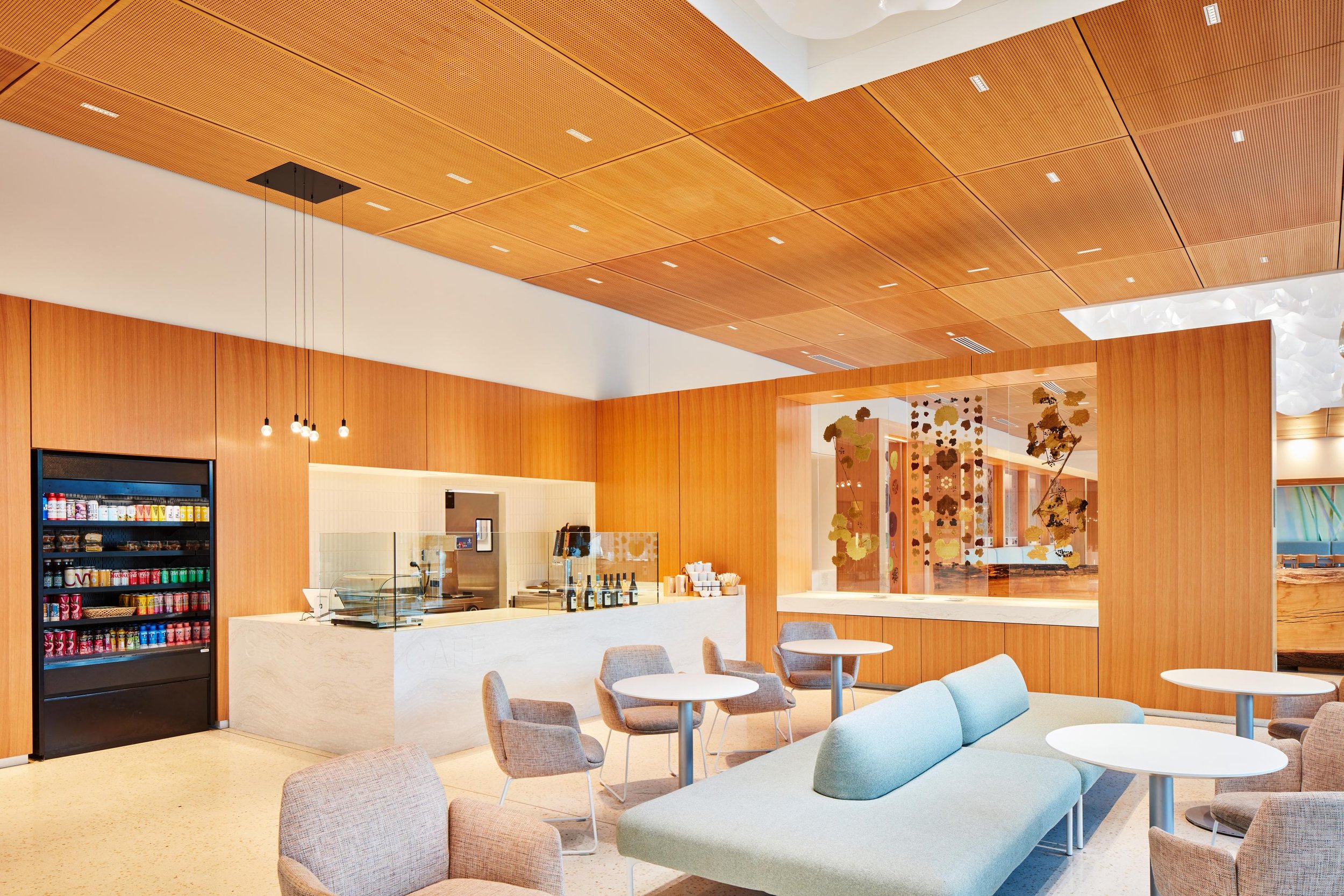
This Café and Restaurant carried on the main building design concept to introduce Biophilic Design themes and messaging that supported the Botanical Garden’s mission and to blur the boundaries between the interior and outdoors. As one enters, the Café and Restaurant’s main rooms feel like they are an extension of the outdoors. Since the Café and Restaurant were operated by the same vendor but simply offering grab and go versus sit-down options, the design deliberately blurred these interior lines of demarcation; a partial height, screen wall provides physical separation, but allows full visual experience. The ceiling plane and its design elements float through like a cloud above. A limited life tree that had to be taken down for the project was repurposed into a log bench designed for both function and “art.” An off-cut of the log became a community table in the main dining room. With the need to define spaces, as well as screening less visibly desirable views, the concept of surrounding the main room with botanical imagery. With the excitement of this concept, the Garden took on their own project, creating a screen that encapsulated their famous lotus pads in resin and allowed one to view the pads top and back sides, as they resemble a sea-like creature.
Photography by Wesley Law and Casey Dunn.
SOPHI Awards COMMERCIAL INTERIOR DESIGN OR ARCHITECTURAL DESIGN: OFFICE
WINNER HOK
A transformation of the historic stove factory into a contemporary loft and tech-inspired office hub. This building, dating back to 1910, had been vacant for nearly 50 years. Housing 140 staff members from one of Missouri’s largest law firms, this revitalized structure stands as a beacon of renewal. Featuring 48,000 square feet of daylit, renovated space, the building boasts spacious interior courtyards, onsite parking and an innovative post-pandemic workplace layout. Embracing its location in The Hill neighborhood, the new headquarters offers a range of amenities, including open collaboration areas, a fitness center, deposition rooms, an art gallery and a mezzanine lounge. From a library with gaming functions to an event space, each area is designed to foster creativity and collaboration. With a focus on creating connections, the design integrates unique elements such as indoor/outdoor spaces, an airstream trailer meeting room, putt-putt greens, and other environments to foster collaboration. With inclusive design features like accessible parking and training spaces, it fosters a sense of belonging and supports diverse needs, setting the stage for further community growth. The building is designed with customizable space for tenants to personalize and adapt, utilizing existing wood roof decking for ceilings to add value for the owner and empower occupants to create a unique environment that enriches their workspace economically, fostering diverse expressions of creativity and individuality while enhancing the community’s aesthetic and cultural fabric.
Photography by Sam Fentress
FINALIST Architect: Jessica Senne, Studio Lark / Builder: Barron Construction
Originally a fuel-and-service station constructed in the mid-twentieth century, this building had experienced many lives over the decades and was in need of restoration. The conceptual objective for this project aimed to uncover and celebrate the gritty character of the service station while simultaneously infusing the interior with fresh, updated spaces appropriate for creative collaboration. Early analysis of the existing structure determined that a reductive strategy would be the best design approach for this project. Interior finishes including a low ceiling grid, carpeting and gypsum board were completely removed, revealing high ceilings, masonry walls and the original concrete slab. The original traces of the service station at both the floor and walls were embraced and preserved for the story they tell. Adjacent these elements, clean casework, paneling and screen walls delineate spaces with a contemporary language. New windows and doors throughout fill the interior with ample natural light and provide connection between interior spaces and the surrounding neighborhood. The restrained interior palette primarily consists of wood, including Baltic birch and Douglas fir species, adjacent white textured tile and painted white walls. The spaces are punctuated with high-contrasting black lighting, plumbing, and hardware fixtures and finished with a collection of classic modern furniture.
Exterior Photography by Sam Fentress; Interior shots by Miranda Kimberlin
FINALIST Builder: Randy Renner Jr., Period Restoration / Designer: Stone Hall Cabinetry
Built in 1928 as Meyer’s Market, the small grocery on Clayton Road was owned and operated by four generations of the Meyers family before closing in 2020. We undertook an extensive renovation of the historic Tudor Revival structure, returning the exterior to its original distinction with a new slate roof and mahogany store-front style windows that admit an abundance of natural light. To transform the interior into a modern showroom on the first floor and second-floor offices, numerous alterations were performed, including the restoration of 14-foot-high ceilings, framing and detailed millwork, fresh interior finishes and thorough plumbing and electrical upgrades.
Photography by Alise O’Brien
SOPHI Awards COMMERCIAL INTERIOR DESIGN OR ARCHITECTURAL: HIGH RISE RESIDENTIAL
WINNER Architect: Tyler Stephens, Core 10 Architecture
Located along picturesque Madison Avenue in historic Downtown Kirkwood, The Barclay and Hutton condominium complex is the final completion of a full block of new residential buildings designed for a single client. Each building is unique in its layout and details, but they all share a single palette of materials for a harmonious blend of brick, slate, and steel. The Barclay and Hutton's spacious terraces draw inspiration from the traditional Kirkwood porch and fostering a strong sense of community among friends and neighbors. The 26 residential units within the two buildings form a new community where modern living meets neighborly bonding. Our architectural design for all of the new buildings along this street capture influences from the Art Deco era, as well as the Arts & Crafts styles that grace the charming streets of Kirkwood's most notable historic streets. This allows blending the past and present seamlessly, infusing the buildings with a touch of timeless grandeur. The contrasting lines and tones of the building's architecture elegantly complement the traditional kiln-fired brick, ornamental steel, dark slate, and meticulously hand-selected Ipe wood details, establishing a stately and welcoming presence that will embraces residents within in a comfortable place to live.
Photography by Tyler Stephens
FINALIST Architect: Tyson Pyle, Acturis / Builder: Brinkmann Constructors
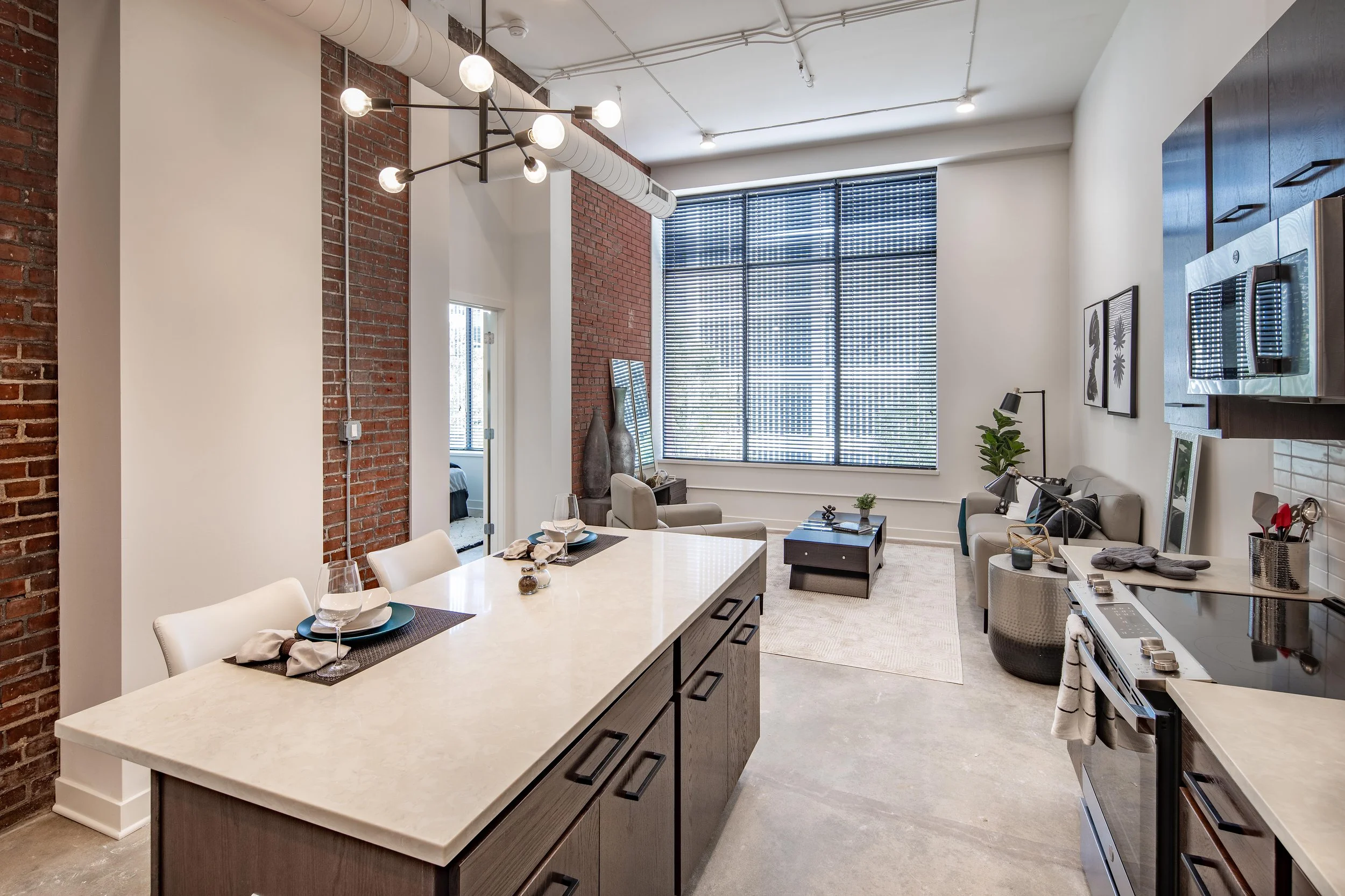
Located in the heart of a major downtown area, this adaptive reuse of a six-story building from offices to a 78-unit multifamily building with amenities is helping to transform the downtown fabric. This project is two distinct buildings with an enclosed atrium. The original building was completed around the turn of the 20th century, and then the modern addition was completed in 1986. The main design goals were to transform this historic building into a unique urban dwelling experience and to enhance the exterior presence of the building from the street, the atrium, and the rooftop. Critical to this design strategy was the removal of the atrium roof and allow the floor plates to have daylight on both sides. This allowed for the deep floors to add another set of units to face the courtyard. Due to challenges with removal of the existing steel in the atrium the team decided to keep the structure in place resulting in a superstructure with added vertical wood look trellis elements which enhances the courtyard experience.
The first-floor main lobby and lounge space is visible from the street helping to activate both the inside and outside. The pool area is in the new open air atrium space. A major part of the design strategy at the interior and atrium was to add new materials alongside exposed existing materials that were previously hidden. The dwelling units have a variety of interesting experiences tied to the building’s history such as tall and exposed structure ceilings, exposed brick and concrete, and varying views of the urban area. Another critical design strategy was to leverage the location with a great gameday experience. The penthouse rooftop provides an atmosphere where residents can watch the game within the comfort of the interior lounge while also experiencing the gameday energy of the adjacent sports stadium from the deck area.
Photography by Matt McFarland
FINALIST HOK
The client wanted to create a truly exceptional residence reflecting modern sophistication through every detail of the space— from artwork and amenities to furniture and finishes. The interior design draws inspiration from the dynamic world of pop culture and the chic elegance of mod fashion. Iconic images of Marilyn Monroe, Muhammad Ali, and Audrey Hepburn grace the living spaces, creating an ambiance that is simultaneously timeless and contemporary.
The interior architecture creates a tailored experience with curved forms effortlessly guiding you through the spaces. A soft color palette informed the interiors with rich textural materials, warm wood tones, metallic accents, and charcoal elements providing a slight contrast. Upon entering, your gaze is immediately captured by a striking chain link sculpture suspended above the entry vestibule. This jewelry-like art installation with gradating metallic tones, sets the vibe for the style that awaits within. Strengthening the design concept, the team carefully curated the interiors with warmth and personality, adding modern surprises and delights throughout. A customized waterjet cut graphic installation of Audrey Hepburn, made from recycled bottle flooring, rests above the entry vestibule and is only visible from the second-floor balcony.
Prioritizing health and wellness, amenities include an indoor fitness center that seamlessly extends to the exterior with cutting-edge equipment. Festoon lights hang above, creating an inviting atmosphere for residents to embrace an active lifestyle. Step onto the pool deck, where a spa, barbecue area, and captivating fire pits create a haven for social gatherings and relaxation. Outdoor amenities include multiple courtyards with two outdoor pet areas adjacent to the luxurious interior pet spa. The carefully designed layout invites residents to connect with nature, fostering a sense of community against an elegant backdrop.
Photography by Alise O’Brien
SOPHI Awards HISTORICAL PRESERVATION: RESIDENTIAL
WINNER Architect: Jessica Senne, Studio Lark
The primary objective for this extensive historic renovation and addition was to seamlessly integrate generous new living spaces into the existing 1920s-era Tudor style architecture. The front exterior facade remains primarily unchanged with only minor refreshes including paint, new house numbers and landscaping. The exterior of the house, however, proudly expresses an expansive two-story addition enclosing cozy living spaces on the ground floor and spacious bath, laundry and dressing areas on the second floor. The harmonious marriage of original architecture with new addition results in a completed restoration where the new respects and enhances the old. While the residence’s exterior endeavors to remain faithful to the home’s original era, the interior of the residence expresses fresh, updated spaces flooded with natural light. New windows and doors with minimized divided lights provide ample visual connection between interior spaces and the beautiful surrounding landscape. Reconfigured ground floor areas encourage free-flowing spaces and allow for an open, gourmet kitchen for owners who enjoy cooking and entertaining. The new primary bathroom suite in the second-floor addition is filled with natural light and finished with a neutral palette of porcelain tile and natural stone. Details throughout the residence include a rich, end-grain walnut countertop at the kitchen prep area that is echoed at the opposite end of the kitchen as a banquette tabletop. A timeless palette of natural materials is consistently deployed throughout the ground and second floors, including natural stone of Carrara and Calacatta appropriate to the era of the home. Low-profile lighting serves to avoid obstructing views of the landscape. Chevron and mosaic tile are utilized in smaller quantities at specialty areas including the powder room and wet bar area.
Photography by Alise O'Brien
FINALIST Meghan Heeter; Castle Design; Caroline Kerckhoff, Stone Wall Cabinetry/Builder: Randy Renner Jr., Period Restoration
Few places feed the soul like a cozy log cabin in a picturesque lake setting. Calm and peaceful, this 100-acre country estate creates the idyllic weekend getaway for a busy, city-dwelling family of five. The property features two historic log cabin structures, dating back to the 1850s, that were skillfully combined into one expansive home. The homeowners set out to transform the already beautiful property into a space that reflected their own personal aesthetic. While honoring the cabin’s rustic features, they wanted to create a bright and airy space that was as tranquil as the pastoral surroundings. To achieve this goal, the design team started with subtle, yet vital architectural changes. A wall was removed to open the kitchen and dining spaces while large-scale picture windows were added to take full advantage of the vast lake views and provide much-needed natural light. A fresh take on a traditional farmhouse workspace, the kitchen was designed to be graceful yet approachable with a handcrafted feel. Custom brass details and cabinetry hardware from Waterstreet embellish the space, while Urban Electric’s hanging pendant provides an industrial touch. From the inset doors to the tongue-and-groove paneling, the cabinetry accentuates authentic craftsmanship and has been expertly incorporated into the exposed log cabin walls. The design team was thoughtful in selecting organic materials, such as the Mykonos honed quartzite countertops and backsplash, which blend seamlessly with the home’s natural wood and stone structures.
Photography by Alise O’Brien
FINALIST Designer: Caroline Kerckhoff, Stone Hall Cabinetry /Builder: Randy Renner Jr. Period Restoration
The original home was erected in 1930. The original footprint was approximately 1700. The goal was to create a first-floor plan that would encompass a larger kitchen and eating area, laundry room and mud room along with a first-floor primary bathroom. Like all additions and renovations, the biggest challenge is to blend both the inside and outside seamlessly. Some of the ways this was done inside was through plaster work throughout the entire addition; hand-hewn beams made to match what was in the original part of the home; creating a kitchen, bar, laundry/mudroom and bathroom design that is not only timeless but respective of the original architecture of the home, and a brick veneer with a matching slate-and-copper roof design.
Photography by Alise O’Brien
SOPHI Awards BEST IN residential or commercial landscape DESIGN
WINNER Designer: Kim Taylor West, Studio KTW / Fabricator: Adam Walters / Architect: Susan Bower, Bower Leet / Landscaper: Bob Wilhelm, Poynter Landscape Architecture & Construction
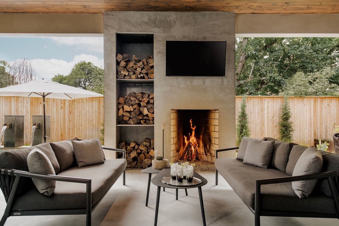
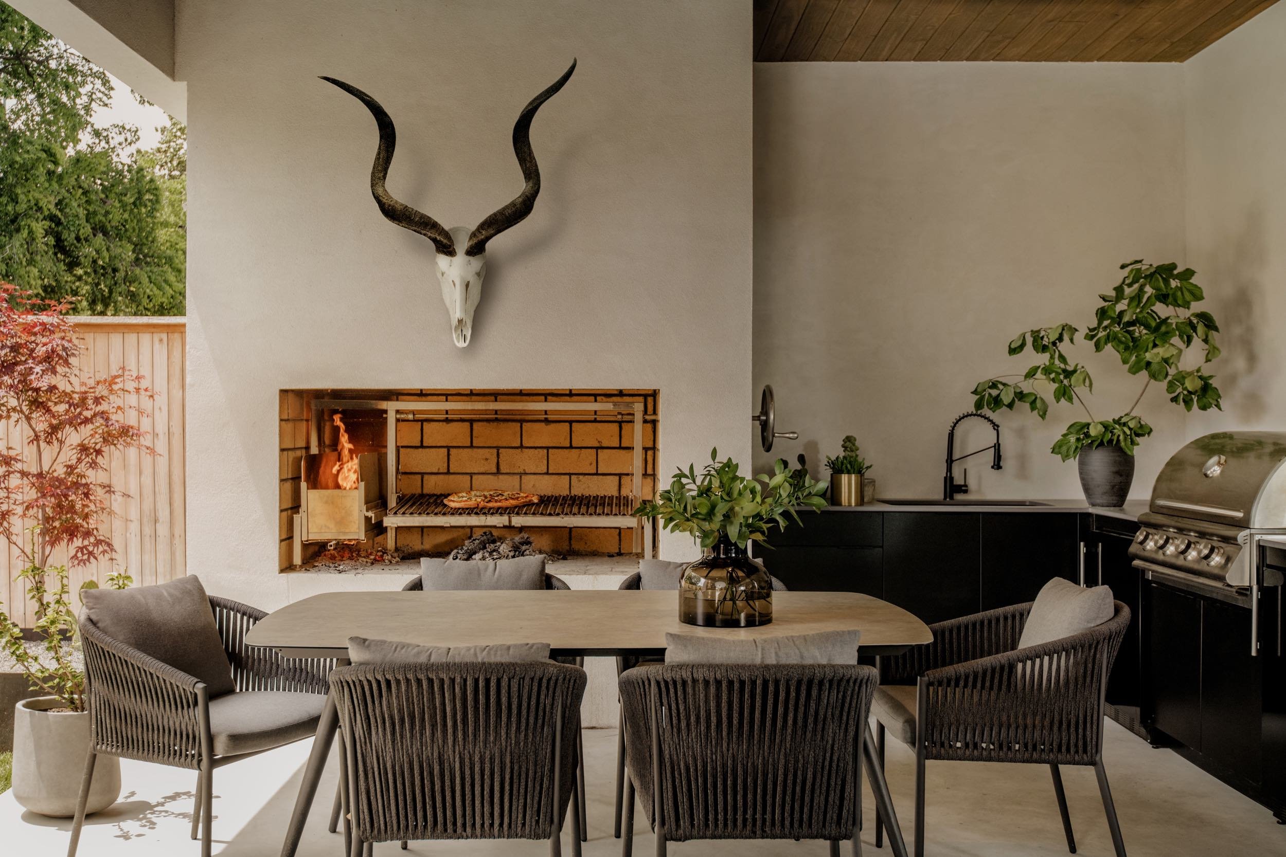
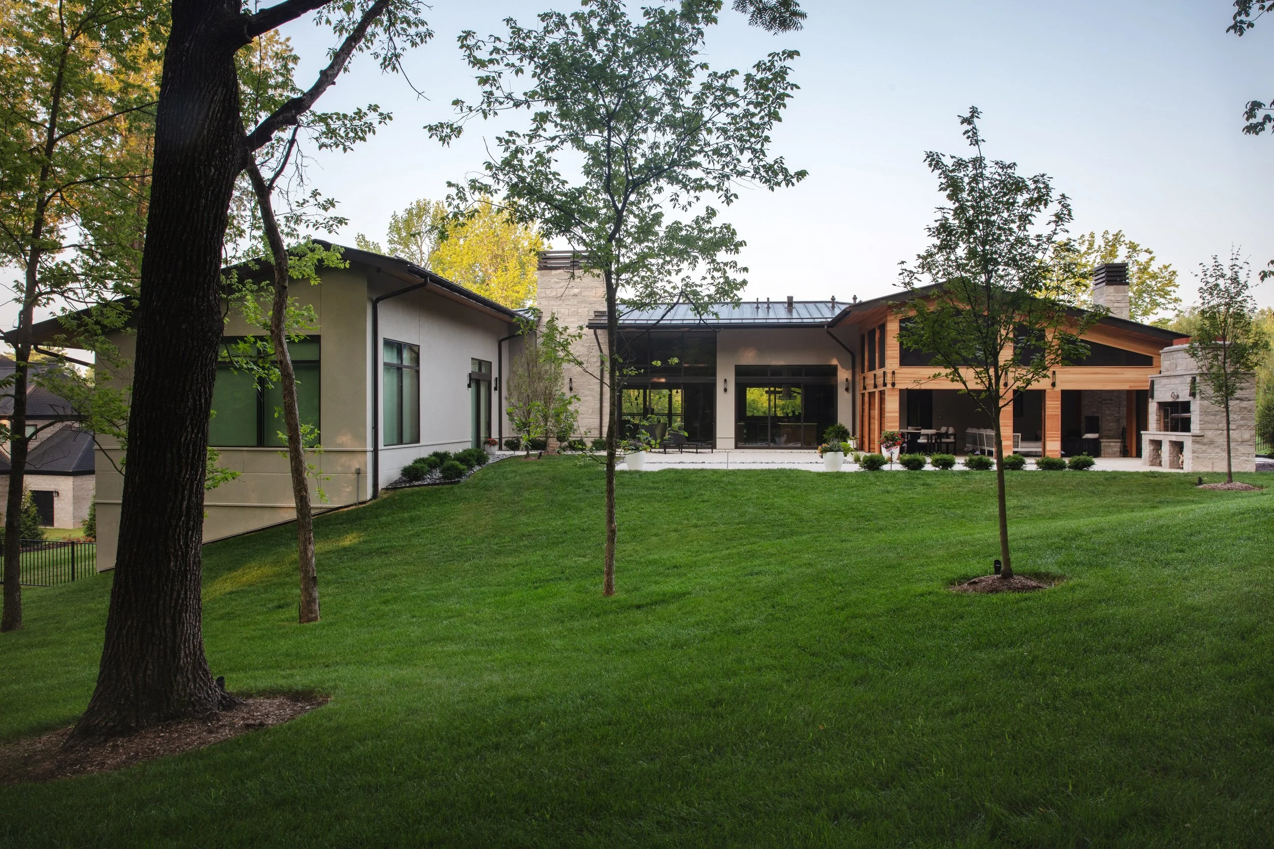
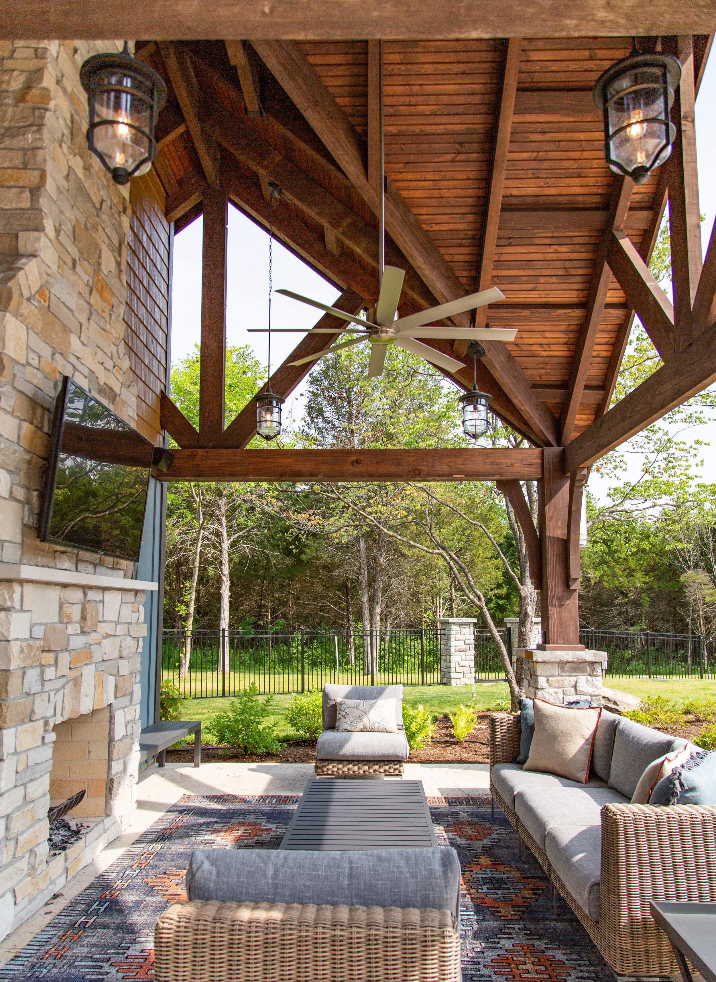
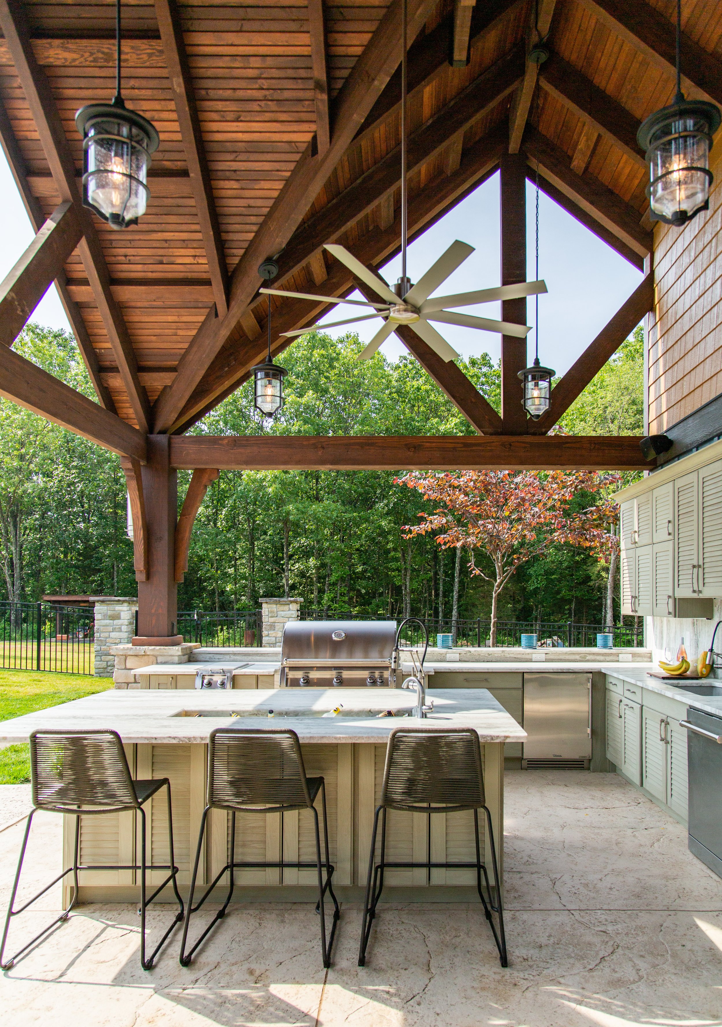
The intent was a custom home with landscaping that was modern and incorporated universal design. The clear challenge was the property being on a large hill. From the beginning concepts, we were challenged to design a backyard with no deck or retaining walls. The patio needed to be on the same level as the main house and have no steps. The parking also needed to be on the main level while the entry level needed to provide a flat entry for people of all abilities. Solutions included a circle drive in the front with a parking area at the same level as the front door. Large pavers and rocks were used in the front and back to create a modern walk area with drainage and style. The front courtyard was created with large limestone walls that have open mouth bronze drains that create a waterfall drainage effect. The back yard incorporated a large outdoor living room with fireplace and phantom screens. The Argentine grill provides an entertaining focal point and great memories for the owner who grew up in Argentina. The tall trees in the front and back balance with the minimal shrubs and modern simplicity. The interior elevator ensures that anyone at any stage in life may enjoy all areas of the house and yard.
Photography by Carmen Troesser
FINALIST Designer: Clay Deschler, Shelton Landscape and Maintenance
We gave this client's front landscape a complete refresh with new paver walkways, boulder steps, tiered boulder retaining walls and new planter beds. The landscape design was done with a simplistic approach, incorporating trees, evergreens, small grasses and a few flowering plants for a pop of color. The color tones in the hardscape elements were chosen to help complement the light, neutral exterior of the home.
Photography by Ty Smith, Studio 724
FINALIST Designer: Kim Taylor West, Studio KTW / Landscaper: Bob Wilhelm, Poynter Landscape Architecture & Construction
Collaboration was the key to this large project. The interior designer, landscape architect and building architect created a rustic resort environment for large parties and daily living. We had many challenges trying to incorporate indoor and outdoor spaces on three levels. Boulders and stones from across the state were used with a variety of native plants. Features include custom waterfall, pool, hot tub and two dining areas. The pool house has an outdoor kitchen, dining table for 16, living room, laundry room, full bath and outdoor shower.
Photography by Kim Dillon
SOPHI Awards BEST IN FURNITURE DESIGN
WINNER Designer: Kim Taylor West, Studio KTW / Fabricator: Adam Walters
This desk was designed to be unique and ergonomic for our client that is 6'8" tall. We scaled it for his comfort and made sure that it had plenty of extra leg room. The drawer section provides hidden Cat 6 wire management. The walnut provides a gorgeous contrast to the white oak and smoke-stained cabinets.
Photography by Carmen Troesser
FINALIST Fabricator: Martin Goebel, Martin Goebel Furniture
When The Muny began their Second Century campaign, it was necessary to cut down the iconic trees that had been planted on stage since the beginning. Knowing the impact of the loss, we salvaged the wood and incorporated it into our renovation work for the administration and back of house project. Renovation work redesigned all of the functional aspects of the historic theater from the dressing rooms to the wig shop to the costume department. As part of the renovations, the main office spaces were also completely overhauled, including the large conference room. The lumber from the famous trees was then made into a custom-board room table featuring inlay design strips along the general theme of the original Art Deco building.
Photography by RJ Hartbeck
FINALIST Designer: Ken Stückenschneider, Stückenschneider Decoration & Design
Lush modernist furnishings are contrasted against Brutalist modern architecture. Comfortable Italian modern furniture mixed with classic American mid-century modern pieces as well as Moderne antiques soften the lines with soft luxurious fabrics in an autumnal palette to connect to the outdoors. Large scale family entertaining now seamlessly occurs in this 1970s Brutalist concrete home built in a forest.
Photography by Alise O’Brien
SOPHI Awards HOUSE OF THE YEAR TRADITIONAL
WINNER Designer: Laurie LeBoeuf, Emily Castle Design / Architect: Paul Fendler, Fendler & Associates / Builder: Minton Homes
Fully encompassing its traditional style, this 1990’s home was completely transformed from a dated, traditional house to something fresh with clean lines and simpler architectural details. As part of an overall transformation, the design team fashioned a stately, two-story brick house with breathtaking views of a sweeping lawn and lovely gardens. Stone trim, arched openings and windows were removed, and a new custom railing at the entry was added. Inside walls were removed, rooms were reconfigured and each space was planned with well thought out details. The same aesthetic continues on the interior, where the designer focused on filling the large spaces with comfort and character. An elegant entryway, grand stairwell, formal dining room, bar and library fill nearly half of the main-floor, while the rest is devoted to a large living room, den and open-concept kitchen. A light-filled breakfast room is tucked next to the kitchen shaded by a towering magnolia tree. Throughout the home, traditional millwork and architecture is offset by transitional, clean-lined furnishings. The aesthetic was inspired by the California hotel, the Rosewood Miramar. The designer was able to give the homeowner the neutral backdrop and foundation that they desired, while working in subtle hints of color and warmth in various locations. To ensure comfort flows from room to room, the designer threaded natural materials throughout. White oak appears in planked floors, while masterfully detailed ceilings, warm white cabinets and select furnishings all play a role in allowing this home’s warmth and beauty to shine.
Photography by Alise O’Brien
FINALIST Designer: Kelly Johnson, Kelly Johnson Design
This century home, built in 1910, boasts outstanding architectural details including generous millwork, tall ceilings, and large original windows. An addition 10 years ago provided updates to the kitchen and bathrooms and more square footage by incorporating a very unconventional floor plan. The objective was to create a functional flow through the house by determining the best use of each room so there would be a cohesiveness to everyday living. The challenge began at the front door, which lacked a proper foyer and bisected a long living room. The strategic division of this linear room ingeniously accommodates a clear passageway from the front vestibule to the deeper parts of the home. This arrangement establishes symmetry and balance and also provides intimate seating for relaxation and entertainment without obstructing flow and movement through the space. A soft palette of pastels establishes a sense of joyful calm and graciousness. Oversized artwork is used to punctuate the room with drama and balance the black-framed windows. Twin abstract patterned rugs incorporate all of the neutrals, pastels and black accents of the room, creating a unity within the space. A standout feature of the dining room is the hand-painted floral mural, in soft lavender tones with metallic accents which are repeated in paired chests and mirrors at the end of the room. A previously forgotten sunroom with terrazzo floors and abundant natural light was sterile and uninviting. Bold color adds coziness with salmon-colored walls, windows and groin-vaulted ceiling. Lounge chairs in cut-velvet coral were arranged in a conversational circle to give this room purpose as a tucked-away space for conversation or contemplation. A cheetah patterned velvet ottoman echoes the whiskey-colored dining chairs in the adjoining room.
Judge’s comment: “I’m biased toward old houses and this one beautifully upgrades a classic while retaining character and personality. Smart use of space, makes this feel so livable and welcoming. Gorgeous attention to detail.”
Photography by Alise O’Brien
FINALIST Designer: Anne Marie Boedges, Anne Marie Studio
The modern farmhouse style was maintained throughout. The view was the most important aspect, as the original 100-year home on the site was torn down for this new home to be built. The view had to match the same sunset and sunrise and the flow had to make sense for this younger family’s needs. The surrounding 800-acres filled with rolling hills and wild turkeys so the style of the modern farmhouse with clean details throughout struck the designer as the perfect style to encompass the home. Large windows framed in black was highly important in the overall scope of the design. A challenge and also one of the best details in the home was the use of exposed trusses and timber framing. This resulted in many unique ways to think about venting, plumbing, electrical and other rough-in elements. The designer sourced hardwood floors for both the main level and second floor loft. The kitchen, which is open to the great room, incorporates built-in appliances and custom-designed cabinetry with a soft white paint and a naval blue island. Just outside the mudroom, there’s a timber-framed walkway with twinkle lights for traveling back and forth to/from the four-car garage with a loft and additional sleeping quarters. The first floor incorporates the primary suite; the lower level houses a bar, shuffleboard, poker table and theatre room.
Photography by Nicole Miget Photography
SOPHI Awards HOUSE OF THE YEAR MODERN
WINNER Architect: Thomas Wall, Mitchell Wall Architecture & Design
In 2014 when George Kaiser donated $350 million dollars to create the world’s largest public park in Tulsa, the surrounding neighborhoods started to change. What was once a blighted area with families choosing to live elsewhere suddenly became a popular place to live. The problem is, not many of the houses there are suitable for young families. When we were approached to design this home, we had to accommodate a lot of programming in a small footprint. Creating a three-story home on a diminutive lot presented a lot of challenges. The client wanted a two-car garage which we knew would dominate the front elevation, so we had to make sure the entry was profound enough to capture your attention. An open-air third-story patio with a cantilevered corner provides views heretofore unavailable in the area. An open-concept floorplan provides visual connections between the living room, dining room, and kitchen with a two-sided fireplace and custom wine refrigerator defining the spaces. With three bedrooms on the second floor, we were able to use the entire third floor to create a primary suite with an elegant bathroom and separate walk-in closets. Expansive windows and the introduction of natural elements to the interior truly bring the outside in for this young family.
Photography by Toni Li
FINALIST Designer: Emily Castle, Castle Design / Architect: Thomas Wall, Mitchell Wall, Architecture & Design
This contemporary home is truly one of the smartest homes we have ever been a part of. Not only is the automation throughout the house cutting edge, but the design itself is a testament to ecological design. With a marriage of technological advancement and thoughtful interaction with the surroundings, this home could satisfy the most ardent of environmentalists. This project is sited on a lot that sat vacant for over 40 years because no one else could make it work. However, with a little ingenuity and effort, we were able to find a solution that not only met all of the family’s needs but also was perfectly suited for the property and its topographical challenges. Featuring four bedroom suites on the second floor and an in-law apartment on the ground floor, an open concept floor plan, and amazing views to the front and back, every room was designed to capture the natural surroundings. Large floor-to-ceiling windows adorn the primary suite and living rooms with carefully calculated overhangs to permit light in during the winter months while providing shade in the summer. The lower level features a home gym, sauna, home office (enclosed by a wine cooler on two sides), golf simulator, and a walk-out pool with a hot tub and infinity edge. Geothermal heating keeps the house in a constant state of comfort, and sensors on the roof adjust the color temperature of the interior lighting throughout the course of the day to match the occupants’ circadian rhythms.
Photography by Alise O’Brien
FINALIST Architect: Derek Hoeferlin, derek hoeferlin design
Completed in 2021, the client for this 4,300 square foot live-work studio is an artist who designs, programs and builds kinetic sculptures that are pattern-based in concept. Other than the foundation and superstructure, the client built the majority of the house himself. Uniquely requesting the majority of his house be dedicated to a workshop, it challenges a typical domestic notion of what a large “house” should be. Sited in the Forest Park Southeast neighborhood of St. Louis, the project is constructed as a series of pre-fabricated steel structural bays clad in a weathering steel rainscreen over rigid insulation and metal framing. The 100-x-30-foot-long rectangular form relates to the surrounding historic late-19th and early-20th century architectural context. The material choice of oxidizing steel is a contemporary counterpoint to similar adjacent brick tones. The short elevation respects and aligns with the front faces of the neighboring row housing. The longer elevation, similar to other buildings along this stretch, holds the edge of the site boundary next to the sidewalk. The more private side-lot of the project is utilitarian in experience and scope, utilizing the double-wide lot for outdoor work and leisure. The interior amplifies the exposed large-scale steel structure with a jet-black, gallery-white and galvanized-silver color palette, providing generous double-height work spaces for the client to build and test out his kinetic designs on polished concrete floors. The sculptures are displayed in a copiously daylit-washed front gallery space, set on wood floors economically salvaged from unused 18-wheeler tractor-trailer beds. The more private second floor living spaces contrast the rest of the project with a more domestic concept that is compressed in scale with a colorful material palette. The entire first floor is dedicated to workshop and gallery spaces, while the smaller second floor is for the kitchen, living room and a small office, bedroom and bathroom, with access to an outdoor balcony and the flat roof.
Photography by Sam Fentress
Steve Smith Profile: 2024 Lifetime Innovator Award
by Craig Kaminer
Steve Smith Profile: 2024 Lifetime Innovator Award
By Craig Kaminer
Steve Smith and I were in the first class of the Biz Journal’s 40 Under 40 in 1995 and like many others in that inaugural class, we became friends. I hired Steve and his partners Paul Doerner and Linda Loewenstein, first on my newly constructed home in Olivette and later on many architectural renovations for our historic home on Westmoreland Place. Looking back on it now, I got to know Steve at a time when Lawrence Group was starting to take off. After those personal projects, the firm did a couple of office interiors for the global PR firm of Shandwick (now Weber Shandwick) and over the years I have featured Steve and his son Will in Sophisticated Living.
Steve Smith, Lawrence Group
As our kids grew up, I found myself sitting in the bleachers of John Burroughs with Steve and his wife, Phoebe, watching our sons play football, and inevitably talking about Steve’s personal passion … motorcycles.
I’m sure many will agree Steve has always been one of the nicest guys you’ll ever meet and what I respect about him most is that he demands a lot from himself as well as the people at Lawrence Group … and the quality of their work shows. He is easy to work with and his partners respect him in ways I have never seen before or after. And rather than resting on his laurels, he is always pushing himself and his team to new heights, taking on new bold projects and encouraging his company and the industry to go beyond the expected.
And St. Louis has benefited from his leadership and drive. Driving around St. Louis, Steve’s work can be seen everywhere…from City Foundry to Angad Arts Hotel, Park Pacific to One Foundry Way Apartments, and Moto Museum to the upcoming renovation of the Mansion House.
When the opportunity arose to present a lifetime achievement award, I immediately thought of Steve. Some others came to mind but I wanted to make sure our first award went to someone whose work and firm will undoubtedly stand the test of time, and his peers would be eager to celebrate.
More recently, Steve has taken up the torch to recommit to a vibrant downtown.
“There is clearly a consensus that downtown matters,” Steve has said. “As stated in the STL 2030 Jobs Plan, there is no path to long term growth for our region without a vibrant central core. I am an architect and developer who has worked in downtown St. Louis for over 30 years. My partners and I have resisted recent pressure from our own employees to ‘move west’ because we want to be part of the solution to some of the challenges of our region, in this case a vibrant downtown.
“To that point, name an American city that is dynamic and growing but does not have a vibrant downtown. Austin, Nashville and Charlotte are growing robustly and are magnets for young people, but not because they have great suburbs — which, like us, I’m sure that they do. Their reputations have risen because they have vibrant city centers surrounded by supportive neighborhoods and suburban communities. As Bill Hudnut, the legendary mayor of Indianapolis, said a generation ago, ‘You can’t be a suburb of nowhere.’
“The renaissances and fast-growing populations in the Midwest often started with those communities finding the civic resolve to reimagine their downtowns as the collective turf of the metro in which all had a stake.
“St. Louis’ recent history is full of examples of this type of civic commitment. A generation ago, Cortex was created on the vision and determination of Bill Danforth and John Dubinsky. David Steward has brought the NASCAR Cup Series and global attention to WWT Raceway in Madison, Illinois. The Taylor family has changed the entire trajectory of Downtown West with their investment in St. Louis City SC and the area surrounding CityPark Stadium. Penny Pennington of Edward Jones has taken on the challenge to create the Brickline Greenway, one of the most ambitious civic projects in a generation. These leaders, and many others, have stepped up.
“The April 9, 2024 Wall Street Journal article highlights how the world may currently perceive St. Louis and reminds us that the entire metro suffers when we avoid tackling the heart of the issue. At the end of the day, that the article was unfair and inflammatory doesn't matter. That perception is out there and will live in Google searches about St. Louis for a long time.
“Until we change it.
“We have proven time and again that when this region has a civic resolve and when individuals step up, we get ambitious and exciting things done. I look forward to seeing a next generation of leaders rise up and make a difference in our wonderful city of St. Louis.”
So its time to celebrate Steve Smith and stand with him to achieve the goal of rebuilding St. Louis. I hope the SOPHI Awards is an appropriate thank you to Steve for all he has done and an inspiration to all of us for what we can all do to help St. Louis live up to its potential.


