The Personal Touch
Written by Jessen O’Brien / Photography by Alise O’Brien
When the Silverbergs bought their West County home, they knew that the layout was just right for their young family. There was a generous family room, eat-in kitchen, and formal dining and living rooms perfect for entertaining – not to mention a sunroom that could serve as a bright and spacious home office.
“When we walked in, it immediately felt like home for all of us – my husband, my girls, and me,” says homeowner Haley Silverberg. The only problem? “Even though it felt like home, it didn’t look like us.”
With its beige walls and medium oak flooring, the interior felt dark and dated. Haley knew that the space would need a serious injection of style. So she started researching designers, calling more than 30 until she came across one whom she instantly clicked with: Chelsea Smith, the founder and principal designer of Chelsea Design Co.
“I called so many designers who asked me what kind of style I was – ‘Are you farmhouse? Traditional?’” recalls Haley. “Chelsea never asked that; she didn’t make me stay in a box.”
Chelsea believes that good design starts by getting to know the client, not with having a preconceived look. “I try to meet people, spend time with them, and really think about how they live their lives so that we can invent a design style together that’s reflective of their personality,” says Chelsea. “Haley and I went to local lighting and furniture vendors so that I could get a sense of what she liked and didn’t like. Then, we created a shared Pinterest and I gave her homework: drink a glass of wine and go crazy – show me what you love, whether it’s a piece of art or wall color.”
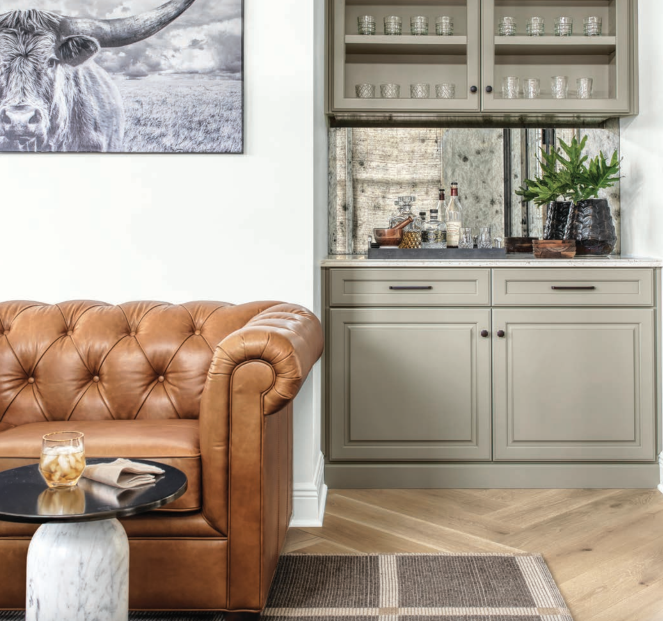
That process revealed an uncluttered aesthetic that mixed natural tones with geometric shapes and modern finishes. Next, they started building the look layer by layer. The almond-colored flooring was replaced with white oak laid in a herringbone pattern, inspired by a photo Haley found and loved. Sherwin Williams’ Extra White paint became another connecting thread throughout the home, instantly brightening the space. Touches of black – lighting fixtures, hardware, and accents – were then sprinkled in to add contrast.
It was important to Chelsea that the Silverbergs’ forever home felt like them. “This project is an excellent representation of how you can take a home that functions but lacks character and weave in really interesting shapes, colors, and other elements as if they were there from the very beginning to create a look that’s fresh, sophisticated, and reflects the homeowners,” says Chelsea. “You can see that overall concept as soon as you walk in the door.”
For the full “The Personal Touch” feature, head to our online issue: https://issuu.com/sophisticatedliving/docs/slsl_j-a_2022

